Monday, November 27, 2017

Shifting Sands


Just before Thanksgiving, I had a chance to get back into the oil paints again.  These images are from a Google Hangout that I did to show how I use the Mig Ammo OilBrushers.

There are a few of the Mig Ammo washes in the little caps... Afrika Korps wash, Dark Wash and Brown for Green Vehicles.  The idea was to show how to vary the tones on a "limited palette" tan color scheme.

I alternated on each wash color as I moved around the vehicle, making sure to have warmer or cooler tones on each part of the hull.  These would be further accentuated by the addition of the OilBrushers.


I put a few of the OilBrushers on a palette, and you can see the variety there as well.  One of the tones is actually a light flesh tone.  That will be used to create the "bleaching" effect of the sun on the vehicle.

As I mentioned many times during the session, the primary source of weathering on these desert vehicles is bleaching, as opposed to rust and mud!


I love working with the oils, because the ability to mix right on the surface as if it were the palette is so much fun!  Using those initial washes as a base, I could allow the more opaque layers of OilBrushers to mix with my washes, creating even more subtle color transitions.


This is especially true in areas such as the lower hull.  The Dark Wash is more of a Van Dyke Brown tone, which is a little cooler.  By mixing in the more opaque OilBrusher colors with this, I was able to get more of a shadow tone without having to mix special colors to create them.


Meanwhile, on the upper hull, I allowed the lighter more opaque tones to mix in with the Afrika Korps wash which was already in place.  Again, it is all about mixing right on the surface.  The whole point of using a material such as oil paints is to be able to do something like this, so why not take advantage of it!


More mixing takes place, adding some layers of lighter colors.  While it is possible to do this kind of mixing with acrylics, it is nice to be able to take my time!  Also, I am trying to be mindful of the bleaching effect that I want to create.


It is important to keep in mind that oil paints should be applied in thinner or thicker layers.  Unlike acrylics, thinner layers of oil paint will not adhere to thin layers already in place.  Therefore, you will want to apply thicker paint to thin layers, and vice versa.


I used a very nice White Spirits to thin paints down, but the OilBrushers are already a very nice consistency, so you don't really have to worry too much about thinning them down.


I also wanted to show how to manipulate and shift the overall tones without having to use washes or filters.  I added a bit of the Ochre to the palette, and that was mixed into existing layers of color to make it a brighter tan.

This higher intensity tan was needed to give that sense of bleaching that I mentioned earlier.  Adding this more saturated tone made the surrounding areas more bleached out by comparison.


Some rusting effects were added to the exhausts, and even a bit on the surrounding areas.


All the while I was working with the oils, I had to keep in mind what I wanted to do later with weathering powders.  I want to have the lighter dusting effect down in the crevices, so I have to keep those recessed areas a little darker than I might do otherwise.


That is also true for the lower sections of the hull, where the sand effect will be very pronounced.


This hangout session was followed by a Facebook live painting session that showed how to do these same desert effects using regular oil paints.  You can watch that here:


Sunday, November 26, 2017

Toys for the Holidays


Most of you probably recall the various toy dinosaurs that I posted to the blog early in the fall.  Those were very unusual, in that they were actual toys.

The material was very similar to BONES, but you could tell that it was not engineered to accept paint the same way as BONES would.  Ironically enough, these are pretty much 28mm scale critters!


The mould lines are impossible to get rid of, and the material is smushy.  To make things more challenging, there is a bunch of raised letters across the chest (company name, copyright, etc.).


This is one of two T-Rex figures that were painted, each one with a different color scheme.


I did have fun with the face on these guys!!


Saturday, November 25, 2017

Hero or Goat?


Ever since I started to publish the how to articles on the Mierce Miniatures Beastman series, I thought people would get a kick out of seeing what the finished miniatures looked like.

As a bit of a refresher, here is how they began, using the Badger Stynlrez primers in the "Primer Painting" technique.


The subsequent painting process played out over 4 episodes, showing how to utilize the Secret Weapon Miniatures weathering paints for the metals, fur, skin and even a banner.  Since those paints are really designed for working in more of a watercolor style, they really make me feel at home!  

This image shows how the rust and other weathering turned out... here's a link to that stage:


If I get the opportunity, I will try to paint something like this unit in oils.  While many of the principles are the same, there are certain physical differences in the paint and the way it can be utilized.  So, if there seems to me more oil painting on the blog, or especially in the upcoming Facebook live sessions, this is why!

Pledging to the Patreon page really helps me to do more of the live sessions, where I try to conduct as many "live experiments" as I can.  Even I learn a lot from those!


Wednesday, November 22, 2017

High Seas


This interesting sculpt is from an old game called 7th Seas.  I don't know how far back this miniature line goes, but I am sure they are well over 10 years old.  It is really interesting to go back and revisit these older figures, especially in the ways elements such as the faces have been sculpted.


Of course, when you deal with older figures such as these, you are not always sure what things are supposed to be.  I ran into this a few times.  


However, I really enjoyed the face, as I could do some fun things with the transitions of skin colors.  The hair was also an interesting style, and certainly not one that I have ever painted before!  That is a rare treat, especially with all the thousands of figures I have painted from so many different manufacturers!

I could not resist going with my traditional blue and gold color combination.  Also, I attempted to infuse as many of the gold surfaces with some blue, and to incorporate a touch of the golds into the blues.  This is why you have a bit of teal mixed in with those blues!

It all has to to with the "color unity" that I preach so often here on these pages.

Making sure that there is at least a hint of each color on all areas of the figure makes for a much more pleasant experience for the viewer.  I mention this even more on the Facebook live painting demonstrations, because it is a little easier to spin the figure around and point out those areas!

Any support that could be offered on the Patreon page will be very helpful in making more of those sessions possible!


Tuesday, November 21, 2017

The Warriors of Winter


It has been a very long time since I have shown any images of the original winter Germans.  This original batch was done with the bark and branch method of basing, and the snow was done using the Secret Weapon crushed glass method.


I really enjoy that snow technique, because you can make a wide variety of snow types with the same material.  It all depends on how much of the realistic water that you mix in with the crushed glass.  More of the realistic water, and you get a more melted snow effect.  The "drier" you make the mix, the crunchier and fluffier your snow will be.


I have painted many different Warlord Games Bolt Action sets, but the winter Germans have been among my favorites.


While there are many different methods and materials for making snow effects, this one has more of a crystalline appearance, for obvious reasons.  You can see that even more when it is painted on the tree branches or on thew caps, hood, etc.


Here's a few images of the whole unit.  I also did the command figures as well as a few weapon teams.  I look forward to doing the next batch for our Staligrand games, so that means doing an urban theme with this snow.  When you add weathering powders into the snow mix, you can get a little more of a dirty snow.


I will try to do this new batch on the Facebook live sessions.  The figures will probably be painted with oils this time around, which should be very interesting!  Stay tune for those, and if possible, please try to support the Patreon page, which makes it possible for me to do more of those live tutorials.

You will also have a chance to win the monthly figure raffle too!


Sunday, November 19, 2017

No More Secrets


One more episode for the painting of the Mierce Miniatures beastmen.  The series began with "Primer Painting" using the Badger airbrush and the Stynlrez primers.  You can find that here:


After taking care of the metals and other elements, it was time to use the Secret Weapon weathering paints to actually weather something!  Yes, even I sometimes use things for the purpose they have been intended.

I usually start off with Old Rust, which is also a favorite skin tone wash too. 


As you can see from this trio of images, you can use those washes a bit like oil washes, in that I apply them mostly in crevices, and then wipe away at the edges.  This is done in a bit more of a watercolor style, with slightly less control exerted because oxidation takes its own course.


This is a good example of how the washes work.  I let them gather in some parts of the application, but pull away at those edges either with a dried out brush or one of  the makeup applicators.

While it is still somewhat wet, I add a slightly lighter rust color, and allow that to mix together on its own.  This is really the unique aspect of the Secret Weapon paints.  They are really meant to do this kind of spontaneous mixing, just as I did on the banner from the last episode.


A third and lighter layer of the rust series can be added, which I usually allow to mix with the other two.  That is another intent of the paints, and that is to mix together.  You can still apply them in "normal" layers of opaque color, which I do all the time.  It's just nice to have this option!


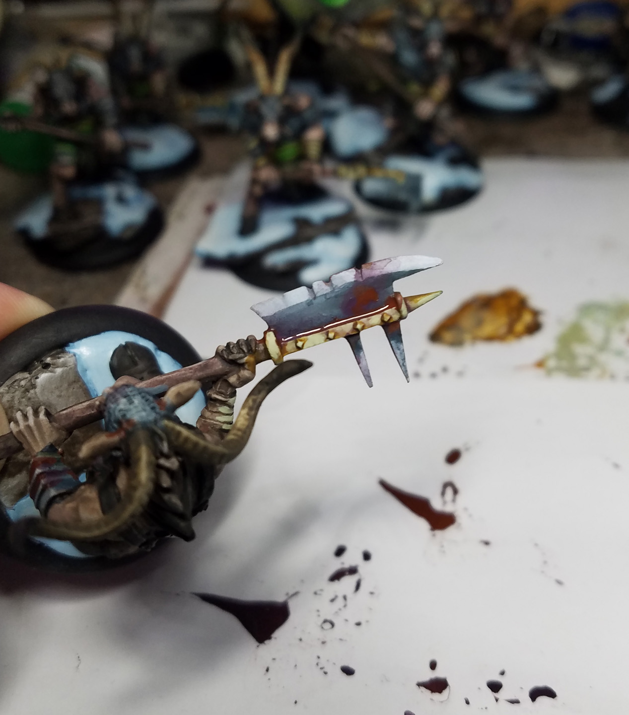
You can see what the various rust layers look like together.  As I mentioned in the previous post about the metals, I made them darker and a bit more blueish so that these subsequent layers of oxidation would show up a little more.


Once that weathering was done, it was time to go back into the metals and add some more lights... using a mix of the lighter Secret Weapon grays and a few lighter Reaper colors.  I wanted to get in all the rust before this stage.  It follows my normal process of working "globally", where I try to get as much of the surfaces covered in colors and values as soon as possible.

This creates context, so I know just how dark or light one area should be in relation to another.


I even took those darker blues and mixed them with the yellow rust, which created a bit of a 'patina' color.  I put this on a few of the bronze/copper bits.


I started to finalize some of the shading on other areas, such as the lion cloths, skin areas, the deepest darks in the furs, and a few highlights on the horns.  There are a lot of different shades of brown, so I tried to make variations in those broader areas of color by making some more greenish, more reddish, etc.


It is only at this point that I start to add in any of the brightest highlights.  This plays off all my years of 2D art, where such details were never added until the end.  As always, it is about context, and having all the rest of the color/value range in place, I know exactly how much is needed.


I have a few of those brightest highlights here, on the weapons and armor. You can see how the armor is meant to play off the snow colors!


I hope that this series was helpful.  I know that it can be difficult to translate all the information on these techniques in pictorial/text format!


This is why I am trying to do more of the facebook live sessions, so people can hear and see these things live on their screens.  To make some "space" to allow for more time,  the Patreon page was set up.  Apparently you can do live streams just for the patrons, and I am trying to set that up. 

Apparently you have to have a bunch of specific settings on your you tube channel, and then get 'approval' from Patreon that those are in place.

Here's a link to the page.  Anyone who pledges to the page gets a chance to win the painted Nocturna miniature which will be raffled off in December!!


Friday, November 17, 2017

A Blog about the Blog!


Now that the Patreon page has been up and running, and I keep talking about what it takes to keep this content flowing on a daily basis.  So, I thought for the very first time, I would "pull back the curtain" and give a sense of what is involved!

It all starts with determining what could be useful content.  Obviously how to posts are at the top of that list!  However, these can be tricky, as these projects are almost always my regular work, which has its own set of deadlines, etc.  Most of the time, I just have to snap pictures on the fly as I am working, attempting to get all the key moments captured in an image.

This does not always happen, which means that I have to do more writing and descriptions about the process.  When working in something like acrylic paints, every second I spend messing around with the camera is one less that I have to manipulate rapidly drying paint!!


All of those images must be transferred and then processed into useable images for the blog.  They must be a certain size, and you get about 15 images to any one post max.  Beyond 15 images, it takes a long time for it to load, and people tend to tune out before the end of the post.  So, I often have to post involved projects in multiple episodes.

This sounds great, but it can be very difficult to get people to realize that they are only seeing one of several episodes!  Therefore, I never go beyond 3-4 at a time.

To cut down on the number of images needed, I try to make "inserts", like the image below...


The "cover image" is very important, as this is what shows up on every blog roll and website.  A text based title will not capture anyone's interest, but you have to make sure that this image is small enough to show up on the gadgets which allow those links.

If it is a full sized/resolution image, the gadget will default to text only.

I often spend more time creating the cover image that most of the pictures in the post.  You have to have one image that captures the topic, but also have a title that can still be read as a tiny postage stamp.


Choosing what steps to show can be a challenge, because some folks are not as familiar with the approaches that I use for various techniques.  I try not to bog down those who are with too much review.


Now comes the most time consuming bit, and that is writing the article itself.  While many people tend to just "look at the pics and run", I feel that it is absolutely vital to try and convey as much information as I can this way.  

I will also try to link back to previous posts, or to refer back to them for people who might be looking at it for the first time.  Again, new viewers come to the blog every day, so I have to refer to past posts or techniques every so often, or to sections of the blog.


Even here, I try to keep each text block to a certain size.  If there is too much text, people will either gloss right over it or skim through.  I don't know how many times someone has asked a question that was answered 5 times in just one post.  Each block is usually 2-4 sentences tops.


Once all the text is written, it is time to set the size of the images, and then make tags for the subjects.  I realized a while back that it was very important to include multiple subject tags for each posts, so that it would be easier for me to find pertinent posts for answering all the questions that I get on facebook every day.  At least 5-12 come in on a daily basis, and having this "Library of Wappelville" is very handy!!

Now you have a better sense of why I started up the patreon page, as keeping this particular resource going is a 14-20 hour a week investment.  Here's a link to the page.  I am hoping to add some more special things, like Painting Pyramid video 'packages' with brushes and materials, etc.

Many thanks to all who have contributed!!!