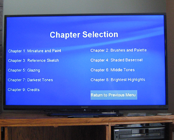
So, the project entered a new chapter over the weekend, as Marty lent me a hand in a task that proved to be far more frustrating and difficult than I had expected.
The task at hand was creating the menu screens, and getting the links to match up, etc. You do this part after videos have been rendered. There were a number of small things that kept conspiring to make things more annoying. Of course, sometimes the only way to find out if it worked was to render it again or to burn another test DVD, etc.
There is a template now, and that certainly makes life easier moving forward!
Now I know how difficult it can be to find your exact 'anchor points' to indicate the chapters. If I make some notations during the editing process, that will go a lot faster! :-)
By the way, this is a 60 TV screen! Yes, indeed. I had never seen something that giant in person before.
The jars of wash looked like 5 gallon buckets of paint!
Lots of text blocks interspersed throughout to make things easier to absorb. As often as possible, I created additional text blocks with definitions of art terms as I mention them, colors, brushes, techniques, and so on. This is partly for non-English speakers, who could then type that text into a translation matrix or something if they wanted to...
The supervisors were right there, making sure everything was up to snuff.


