Thursday, January 24, 2019

More Giants!


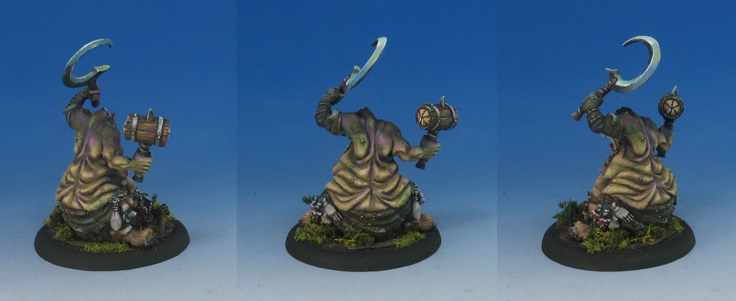
After painting the first Savage Giant from the new Free Folk army box, I was really looking forward to painting his buddy!  If you want a peek at the first tutorial, here's a link:  https://www.youtube.com/watch?v=1LvJv3dyjEw


As always, I start out with the Shaded Basecoat and glazing process, establishing all the lights and darks as rapidly as possible.  Once those initial colors are in place, it makes is a lot easier to build off of them.  For instance, having the blueish gray skin colors already on the figure from those first layers means all I have to do is put some additional layers of pinks or greens.


Just like the original giant, I did some snow and ice effects.  Since he has a pretty hefty beard, I tried to get some frost effects around his mouth.  That was very fun!


Here's some images of the completed giant, including his movement tray.  The balance of greens and umbers play off each other, and the more grayish skin tones.


You can see that play out in these images.  I also discuss how to work more variety in surfaces such as cloth, and how even that surface can reflect color and light (even though it is not reflective like metals).  The parts of the cloth that are closest to the ground have a cooler, blueish tint, while those facing upwards are a warmer, more yellowish green.


At one point in the video I turn off the saturation completely, making the screen black and white.  This means that only shape you see is provided by the shadows and highlights.  The cloth retains all of its shape, but now you don't see that blueish color tint.


Each of the tutorials I create has that kind of in depth process.  You see every brush stroke possible, and you get an explanation behind every color choice, every highlight, and so on.  I try to repeat these things during the recording to reinforce the information, and make it easier to remember.

I have dozens of painting tutorials on my Patreon Page, which cover every possible technique and topic.  Not just painting, but basing, terrain, and more.

A pledge of just $5 can get you access to tutorials such as this.  Each one is about 100-130 minutes long.  The Army Painter pledge level of $15 will provide access to all tutorials that I do each month.


Joining in on the Patreon Page will provide you with access to a vast number of tutorials, and brand new content every month.  I already have several Song of Ice and Fire unit tutorials in progress, including the Night's Watch Ranger Hunters and the Free Folk Spearwives!

Here's a link to the page... once you sign up, I immediately send you links to tutorials to get you started: www.patreon.com/JamesWappel


Wednesday, January 23, 2019

Listen to the Trees


This is a sneak peek at a new set of tutorial videos that I will be doing on some older GW Dryads.  It has been many years since I last painted one, and I thought I could roll the camera as I work on these!


These new videos will be more of an "At the Workbench" setup, where I show you how I go about painting things for commissions. It is not very different from how I do everything else in terms of technique, but the mindset does change quite a bit.


I will also be going a little more "Old School", where I have these brush primed with 1 color, as opposed to the "Primer Painting" you see more now.  I wanted to show you a more classic Shaded Basecoat technique!


This episode from another ongoing series should give you an idea of that kind of priming.  Then I will work my way trough a few of these figures using a variety of glazing and other techniques.  A few of the episodes will be available to the general public, with the rest for my patrons of the Patreon Page:  https://www.youtube.com/watch?v=nTHBkXNCDlw


Tuesday, January 22, 2019

Hammer & Sickle


This very old hunk of metal really took me back to the early days of our painting experience.I remember when I first saw the old Confrontation figures, and noticed how different they were sculpted from everything else at that time.


I think the next transition which was that noticeable was the ZBrush phenomenon a few years back.  You can tell when something has been digitally sculpted quite easily, just by the flow of the lines, and how most organic surfaces are rendered.  I remember how intricate these Confrontation minis were when they first hit the scene.


There were many more details on those figures than you had typically seen on sculpts of that 2001-2003 period.  Now with the digital sculpting, it is commonplace. 


These solid metal figures are certainly a lot heavier than the resin and plastic figures you will see today.  It is so strange to think that metal figures are the least common materials nowadays!


Sunday, January 20, 2019

Combo Platter


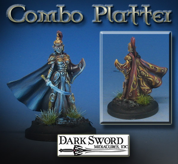
The latest Painting Dark Sword tutorial is up on the Patreon Page now!  I really love using the Dark Sword figures as subject matter, because they have a lot of fine detail, and always plenty of character.

In this episode, I was trying to show how to combine several techniques that are usually broken out into individual episodes.


This time around, I wanted to show how to combine Object Source Lighting, Freehand and Non Metallic Metals all in one lesson.


I showed how I go about transferring a pattern onto the figure, sketching it out first to get the "muscle memory" and also a sense of what might have to be eliminated or added to make it work.


It is not unusual to have to put several major techniques into one figure, which is something I have to do every day.  The idea is to give you a few easier ways to execute these techniques, so that you feel more able to do so yourself.


I think most tutorials only do this kind of combination on huge figures or busts.  Very seldom do you see 28mm figures get the same treatment!


Well, since 28mm figures are what I use (and my commission buyers), that means doing all those nifty things you see on 75-100mm figures on the "little guys".  It also has to be done in a timely fashion!


None of us has infinite amounts of time to spend on our figures, even though we wish we did.  In this lesson, I show you some ways to do that... and even play around with some home made static grass tufts!  If I can bring in the funds to set up a second recording station, I will be able to make an entire video series on creating those tufts as well!


When you pledge to my Patreon Page, you will get a great deal of content, in the form of one video tutorial after another (the Army Painting pledge is about 15-20 hours of videos each month!).  I try cover all aspects of miniature painting... basing, oils, acrylics, weathering powders... whatever it takes to get the job done.


The special $10 Dark Sword miniatures pledge not only allows you to check out all the Dark Sword tutorials, but all of the other 'general technique' episodes.  These often focus on experiments with new materials or techniques!  That's all right here on the Patreon Page:  www.patreon.com/JamesWappel


Saturday, January 19, 2019

Cold Snap!


This unusual Ice elemental posed a real challenge with all these different facets pointing this way and that!  It also meant having to work in a narrow range of blues, blue greens and even blue-gray.


The shadow areas not only required more of that blue gray, but also some teal mid tones in order to convey some semblance of translucency.


I do have a Facebook live video on another ice elemental from Mierce Miniatures which gives you an idea of what I am talking about:  https://www.facebook.com/james.wappel/videos/vb.1056181987/10212023583879015/?type=2&video_source=user_video_tab


I will definitely try to create another full scale tutorial on painting Ice Elementals at some point, so stay tuned!


Friday, January 18, 2019

Take the Black!


Series 6 of my Army Painting tutorial videos is well under way!  In fact, I am already filming the third installment of the five part series.  Each of these Army Painting series is around 11-13 hours long, covering every step of the process of painting a unit.


In this case, I was working on the "Color Test" figure, where I not only establish the look of the figures, but assess how long certain effects will take.  When you multiply the 5 or 10 minutes a given effect might require by 12, and then by 4-5 units of 12, you can see how that adds up!

So, all the while I work on these figures, I am constantly figuring out what is worth my time to create, and what needs to be "inferred".  

By inferred, I mean using some very quick and simple glazes to tint things, or to indicate there are more shades of color than I actually took the time to paint!


Of course, I also had to figure out just how much snow effect I wanted on the bases, and see what might be possible on some of the action poses like this one.  I was able to utilize the Secret Weapon Miniatures crushed glass method to get that scattered snow effect, as if he were kicking up some of the snow!


I added something else to this series, and that is a quick step by step of the priming process.  So many questions have been asked, I thought that I might include it on as many videos as possible.


I am using the Badger Stynlrez Primers and a Patriot 105.  They cover the figures very well, and provide a very sturdy and rugged painting base!


As always, I try to present as many options as possible, instead of hard and fast "rules".  You could brush on this primer if you don't have an airbrush.  Should you prefer the spray can primer (where you have much better weather for such things than I do!), you could do a very similar process with those.


Here's the Color Test miniatures painted in Episode 2.  I love the action and movement of these archers!


During the video, I go into the ways I use to get the most out of a so called "limited palette".  While there are not a lot of paint colors on the palette, some very simple mixes yield a host of options.

Take the backpack for instance.  I think you can see the hints of greenish grey in the midtones and light shadows.  This gives the look of aged leather and brings it more in line with the other blueish and greenish shades around it.  It took very little time to put that in place, as I was already using that color to put light tones on the hood and pants!

I even did my little trick of taking out all the saturation on screen, so you could see how the shading looks as it should, but when the color is restored, you get that more interesting look to the leather.


I will be doing the entire Night's Watch range in these video Tutorials, along with the Free Folk faction.  Some of you are already aware that I have a full series on the Lannister Halberds, with many more on the way for Starks and Boltons too!

If you join the Patreon Page at the $15 a month level, you will get access to all the previous series, as well as 15-20+ hours of video content every month.  The full range of Song of Ice and Fire miniatures will be covered in my tutorials, including terrain and battle reports!


Here's a link to the first episode of the opening episode from Army Painting Series 6: Basing the unit!  https://youtu.be/INPfPLCTZcE


The rest of the series will be available to the patrons of the Patreon Page, with episode two premiering today!   To become a patron, here's a link to the page:  www.patreon.com/JamesWappel


Wednesday, January 16, 2019

Dragonfall 2


This beastie from Mierce Miniatures was an interesting exercise in the full range of greens!

As I have tried to show in a number of my painting videos, these can range from blue green to almost yellow from cool to warm.


Saturation is another added element to this difference in tones.  You can even have the same kind of yellow green or blue green, but if it is toned down with even a little bit of red, it begins to read as more grayish to the eye.


You can see in some of these images how the yellowish intense green on the underside of the wings contrasts with the more muted, blueish greens on the back of the wings.  This is a subtle way of getting that contrast without resorting to radical differences in how light or dark the colors might be.

During my tutorial videos, I like to turn off all saturation at a certain stage to show how you can get "sneaky" contrast like this.

If I were to make this a black and white image, the two sides of the wings would look identical!


I also incorporated some reds in certain places to get one extra level of contrast.  So, the reds are placed where the green and the yellow of the two sides of the wings joins.  This is also a bit darker than the rest of the wings, adding one more type of contrast.


I already have a number of tutorial videos on painting greens available to the patrons of my Patreon Page at: www.patreon.com/JamesWappel