Tuesday, November 14, 2017

Forest Mist


The second episode in the painted backdrop series begins with the second section, which was the "moveable" version, or the free standing piece that could work on either side.


I have published a few articles already on how to match your terrain to your mats.  This mat by Table War has some very rich greens, particularly along the edges.  This meant that I had to make some adjustments to my backdrops.

This was a happy accident, because I needed to go lighter and warmer anyway to make the "forward" edge of my backdrop come forward!


This is what 12 feet of painted backdrops looks like!

Again, using the Badger paints and primers was very useful, working with the Patriot 105.  The misty nature of the scenes is necessary to make this flat upright board flow into the background instantly.

When I placed my new backdrops  next to the mat (from Table War), I saw that I needed to make some adjustments.  This was not a surprise, and you will see how those corrections were made later in the post.


It was nice to get the first views of the backdrop behind all the terrain that I had worked so hard to create!
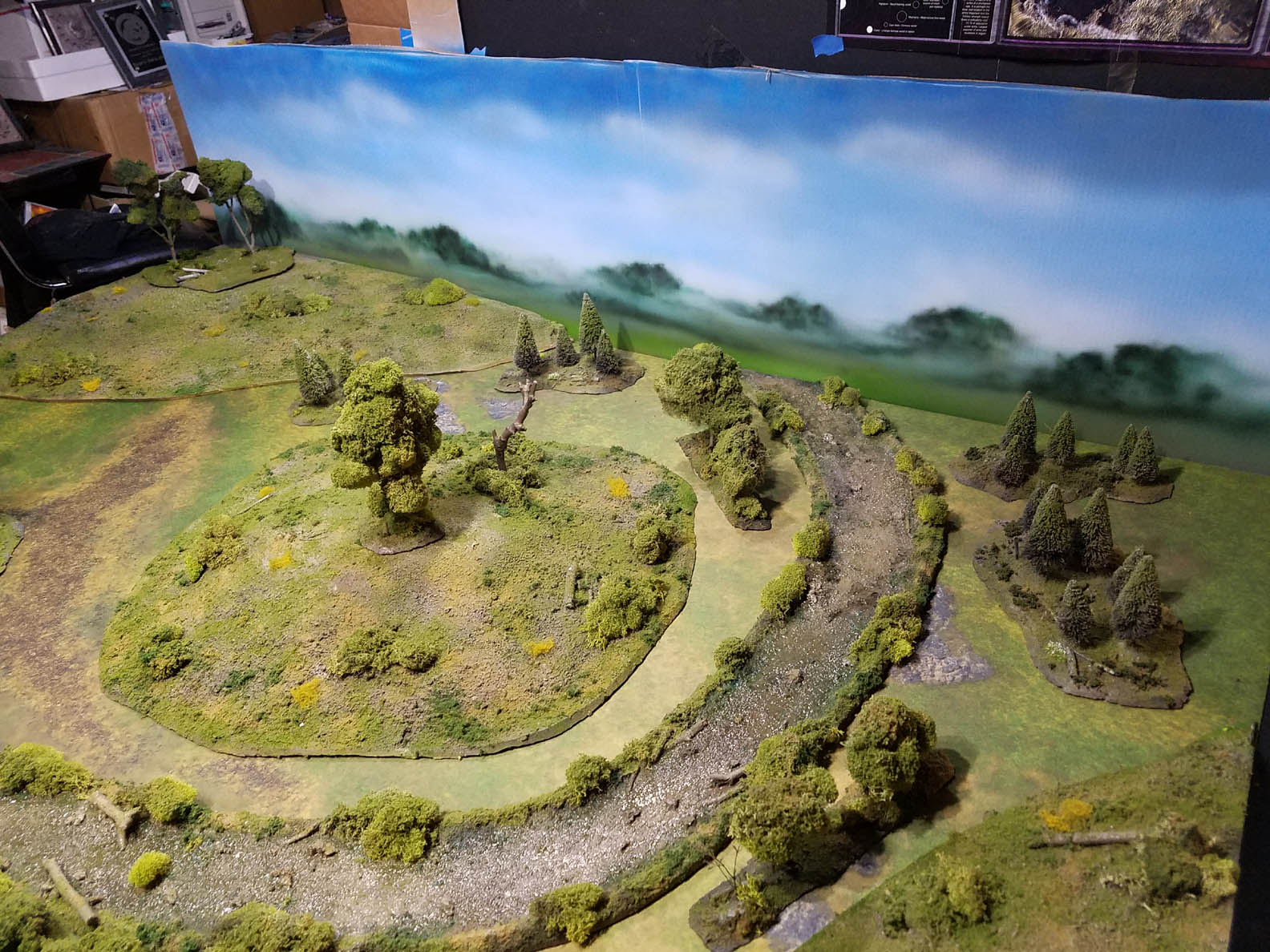

In this image, you can get a real sense of how I tried to mimic the appearance of the "real" terrain on the backdrops.  Gently rolling hills and clumps of trees off in the distance would be an ideal image to have in the backdrops of all my battle report images.


I was very happy with the way the two sections blended together at the joint.  Even at this '"open" end, it was blending in quite nicely.


The advantage of having those corner hills meant that I could hold the corners together very well, and hide a lot of the seam.  The downside of that was that I had to make the horizon line a little higher to compensate... making it more difficult to get that far distance flattening of the landscape on those backdrops.


These ground level views are the entire reason why I wanted the backdrops.  When I take the images of what is happening on these battlefields, this will be the primary 'cinematic' angle.  Constant images from the bird's eye view get very boring in a hurry!


I still can't believe how it has affected the colors of my terrain and the mat.  Before the backdrop, the colors seemed burned out in some places, or grayish.  I really loved this surprise!  I knew that I was using some nice rich greens and browns on my terrain, but it was not until now that I saw this.


Troops moving through these woods will have an extra level of realism to be sure!


This trail that was part of the battle mat was nearly invisible from this angle prior to the addition of the backdrops.


At this point, I did make some adjustments to my terrain pieces, just as I would do on the backdrops.  I used the airbrush to add the same brighter greens to the edges of my hills and forest sections which would echo that on the battle mat.

I even sprayed some color on the tree foliage, which made a dramatic difference on some of the sections which did not get as much coverage of the flock on top of the original moss.


As I looked at how the various areas of the backdrop meshed with the terrain board, it was clear that the scatter terrain I mentioned would be necessary.  I thought that I would experiment with a few items that I had available.

Some of this were pieces of grassy 'carpeting' which will be used for farm fields.  It was easy to cut these leftover strips into irregular shapes to place at these seams.  The clumping flock from Woodland Scenics could be piled on top of this to create some instant terrain.


Here are a few images of how this worked out.  I will definitely make some more special corner sections of trees and bushes for these areas, which will be the next tutorial on this board.

Once again, if these articles are helpful, it would be great if any contribution could be made to the Patreon page:


Monday, November 13, 2017

Building a Backdrop


This unusual project is something that I have wanted to do for many years, a backdrop for my terrain board!

I cannot recall how many times watching or looking at battle reports the inevitable piles of junk or other distracting things would show up behind beautiful tables of terrain and painted minis.  I had grown tired of spending hours in photoshop blacking out these messes :-)

There are many different ways to go about this, but I also had some restrictions on what I could do.  I had already tried some cloth backdrops, but they didn't work out very well.  The photo backdrop I had purchased was not a very good color, and I could never get the folds out of it or keep it from wrinkling.

My favorite material to use would have been the thin underlayment foam which I use for my terrain, but I need to save that for my terrain!

What I had available were a number of large pieces of cardboard, so I set about making something I could use from that simple material.

It all starts with the mat, which is from Table War.  Most of you have already seen the how to posts on building all of the hills, trees and the river.


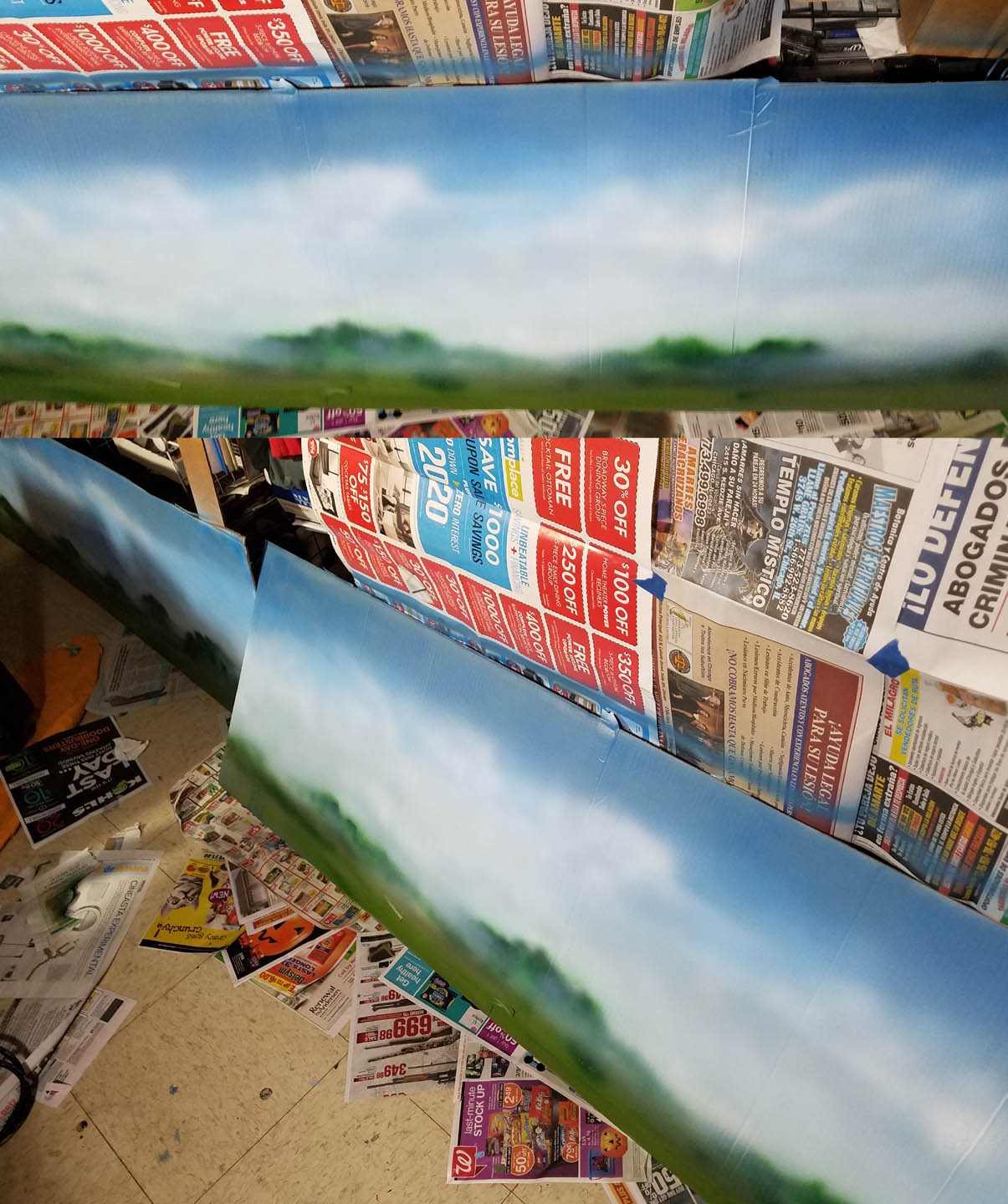
This view shows the issue. any time I wanted to take a picture (or film video) from one end of the table or the other, I was going to have a very unsightly view.  Unlike the 'main' backdrop section, there was nothing behind it to support a big piece of cardboard.

The lower image shows how I made supports for the side wall section by making a few vertical ribs.  Now I can take this single section and use it on either end of the board, moving it when I am taking pictures from either end.


Since I will always have some kind of corner terrain, that will help to keep the boards in place, as well as hide any joints.


Even in this unpainted state, it is already an improvement!  I have spent many hours in the past trying to crop out or black out distracting objects behind my terrain boards in battle reports.  Why go to all the trouble of painting minis, making terrain and having the battle mats when piles of whatever will be seen in the background...


I was able to get the camera angles pulled back a lot more without having to worry about what would be in that background.  I can crop out most of it, etc, or more easily photoshop some more.  The only option I used to have was to black everything out.


I was especially eager to see these ground level views!  Without a backdrop, this angle was almost certain to show piles of art supplies lurking behind the board.


I switched the board to the other end of the table to see what that would look like.  Since I took these images, I have since made some more simple corner and straight wall elements to better make this blend in.


Time to paint this!  However, this phase will be tricky, given the use of cardboard for material.  If I had used the pink foam, I could have used a brush. and any kind of paint that I needed.  

Doing so with cardboard would have guaranteed that it would warp with all that moisture, so I tried to prevent that. I had a can of regular spray primer, and used what remained to at least get a coating on the cardboard.

Using an airbrush to paint it (a Badger Patriot 105) would cut down on this moisture drastically... and it would also save a TON of time.  In addition, it would give me the soft, misty look required to create an immediate sense of depth.


After working a number of sky colors onto the board, including the Stynlrez slate blue, etc., I used some of the "landscape paints" that are also made by Badger.  These were originally intended for model train builders, so it would be perfect for this task.

You can see how soft the horizon line is.  This is essential, especially if I am taking any images of figures close to the backdrop.  It must immediately sink into the distance.

The primers and paints from badger are now at a new website.  If you use the discount code wappellious, it will definitely save you some cash :


To create a few tree lines that mimicked my terrain board, I ripped out a few shapes from my newspaper to get some randomness.  I made sure to leave the lower section of each tree stand the original sky color, which would give me more of the misty feel.


I constantly looked back at my terrain board to see just how I could get the same feel in the distance.  The ends of each board had to be as "generic" as possible, with no tree stands and the exact same horizon line.  Keep in mind that I have to match four different edges with just two pieces!


I mixed a deep green with the Ebony Stynlrez primer to get more definition in the tree lines, and get a 'layered' look to create more distance.  As I got closer to the front of the scene, I used some more warmer and more saturated colors to further push my orginal sky and tree line into the distance.


If I were simply painting a forest scene, I would more detailed elements in the foreground, but that cannot be done here.  Since I want to move my terrain around, this scene has to be more like wallpaper, a soft pattern that is barely noticeable and repeats itself over and over.


The larger section is done!  This gives you a sense of how big it is... around six and a half feet.


Uh oh, what is that lurking in the forests of France?  Beware the battlefield T-Rex.

In the next article, I will show how I painted the other section, and discuss a few methods for dealing with seams as well as matching the colors of the battle mat.

If you want to see more unusual articles like this, it would be very helpful if you could support the patreon page.  This will allow me to have a few free moments to tackle projects such as these with all the engineering involved!


Sunday, November 12, 2017

Blood and Ice on the Pitch


These Rolljordan Blood Bowl figures were very different from the told GW Norse figures that I had painted in the past.


I used the same kind of "Primer Painting" technique on these guys that I had on the Beastmen that I had been working on recently.  This group was particularly reliant on the post primer glazes!


This is also one of the very critical reasons that I used many layers of the Stynlrez primers, because Blood Bowl figures can spend much of the game face down or flipped over.  That is a lot of extra abuse that most figures don't see.


Speaking of the primers, there will be a new website where you can get them, with an easier layout to find what you need.  If you use the discount code Wappellious, you will get a nice chuck off the order :-)


I also tried out a new snow technique on this group.  Originally, it was supposed to be for terrain, but lo and behold, it is a very sturdy, very quick way to get some nice fluffy snow!

I put down the Vallejo Ground Texture snow first, piling it up like I do with the Oxide Paste and other mediums.  While that is still wet, sprinkle some of the snow flock on top.  It gives a very nice added texture!

You can even add a little bit of sky blue paint to the snow to give it a bit of a tint, and make it more icy.


Saturday, November 11, 2017

Shades of Gray


In the previous episodes, you saw how the figures were "Primer Painted" and the first layers of glazing.  The process continues with more work on the bases and the initial glazes on the metal surfaces.


I mentioned in the last post that glazing is not always about making things darker.  You can also do lighter glazes, which is what I am doing here.  In fact, I was also able to add in these lighter colors while the previous layers of glazing were still wet.


This greenish color was used on all the lion cloths, and that process of wet into wet was used to get some lighter tones in very rapidly.


I added in some warmer Secret Weapon weathering paint, and that was used to make the lighter tones.  Again, it was done so quickly, the paint didn't have the time to dry, allowing me to use that wet into wet method.


All the tunics have a decent amount of shading on them.  The deepest darks and highlights are yet to be placed, because I want the 'context' of all the other colors surrounding it first.


I brought out a few Badger paints to work on the snow.  This is mostly due to the requirement that all my snow match previously painted figures.  Since I have a lot of these two Badger colors, I knew that I would never run out!  

Also, I wanted to show that just like the primers, Badger paints can be used with a regular brush... no airbrush required...


The process was pretty simple.  Mix up a middle tone color, and apply that all around the hooves and rocks.


As you might imagine, progressively lighter layers were applied.  While I do emphasize glazing quite a bit, I still use layering when it is the right approach for a given result.


As I work on these layers, I am using one of the #8 round craft brushes which is a bit worn out.  This means that I can "flatten out" the bristles of the brush, which in effect creates a Filbert style brush.  This is excellent for feathering out each layer of paint, acting like an airbrush.


With the bases painted, I moved on to the metals.  These will eventually be heavily weathered, but I need to get some blue/greenish gray shading on them first.  I will use a few Secret Weapon weathering colors, along with the Grey Liner from Reaper.


I thinned down the lightest grey for the first layer, removing the excess with one of the makeup sponges.  I don't want to destroy all of the lighter colors that I established with the primer painting.  Also, keep in mind that several darker layers of glazes will be added after this.


I worked from one beastman to the next, setting up the second and third layers of glazing.


You can see the effect that the second darker layer of glazing has.  Stay tuned for the next episode, where I will put additional layers of glazing on the skin/fur, begin to weather the metals, and work on other elements... stay tuned!

If these kinds of how to articles prove useful, I have the patreon page up and running to try and fund more articles like these.  While I love taking pictures of the process, and making the step by step articles, it does slow down the progress that I can make on commission pieces such as these.

Even a $1 pledge is very helpful, since that will also go towards more supplies which I can use for live experiments, etc.

Here's a link to the page: