Sunday, May 26, 2013

The forest for the trees... some glazing


Here we have the miniature which I will be using for the glazing video.  This tree warrior is from Raging Heroes.  This video will be a bit different, in that the painting of the base is a big part of the lesson.  My purpose is to show the glazing as much as possible, so  I want to have the surface textures of the base included.


This guy is painted in a more 'uniform' base set of colors to begin, to make it much easier to demonstrate how you can manipulate the hues and colors of your glazes to tint your darker colors.


I didn't want to get caught up in NMM, or anything of that nature, so I went directly to nature to find a more 'neutral' set of textures. :-)  This way, it's all about making things darker in an interesting way.


On the subject of Kickstarters, Raging Heroes has posted a few new characters on their website.  This is yet another character for the upcoming kickstarter.  I can think of one or two IG characters she could stand in for!!!


Dark Age Kulkulkani War Captain


Back to the Blue guys!  This is the Kulkulkani War Captain.  Just as it was with most of the others from this faction, I had some fun painting the flesh tones. :-)


Also, I was able to juxtapose that blue flesh tone with some nice warm oxide browns.  Tack on that little bit of golds, and you have a fun color wheel miniature!


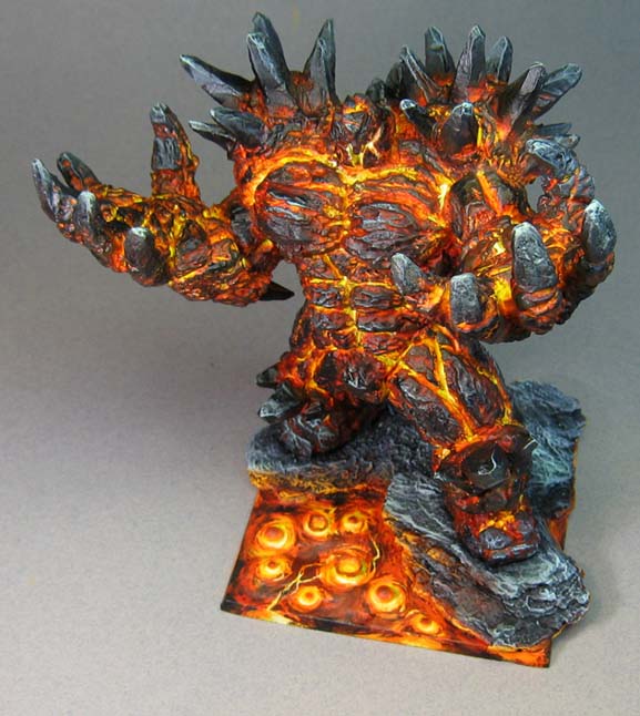
Rothand Studios Lava Golem on the grey backdrop


I mentioned that I had some more images shot on a different background, and here they are. :-)


That is a much larger sheet, which mean that I could take a much bigger variety of angles, and also bring the camera in a little closer.


When the backdrop is too small, I have to pull way back, and that leads to much smaller images.  Plus, the neutral tone of the grey helps the lava to shine much more.  The black and other darks are also not as harsh as they might be perceived against the white.


In general, the blue to white fade seems to work well for the greatest variety of figures.  The smaller individual characters really fit this mould.


Speaking of mold, there must be a lot of it around, as it has done a number on me since we returned from CMON Expo.  It's been hard just to see at times.


That's one reason I have worked on this guy, along with lots of prep work the last week.  When you can hardly see or breathe, it's best to work on something big!  It's like giant type on a Kindle for readers with eye issues.


I look forward to this latest blast to pass by, since it it very difficult to do any small work.  I must have poked myself with the files a dozen times today alone ;-)


I was working on the glazing miniature today.  I should be posting images of that tomorrow at some point.  Glazing sure came in handy with this big boy!!  When I look at a lot of the back views or images from underneath, the orange and orange/red glazes toned down parts of the lava glow just enough to give specific points extra zip.


These few views really got me thinking about that topic...


Stay tuned for much more!


Saturday, May 25, 2013

Dark Age Games Kulkulkani Devoted Priest


Since Dark Age has been releasing lots of new stuff these days, I figured that it was time to start posting some of the Kulkulkani figures which i painted for them.  In this case. a Devoted Priest.


I enjoyed painting the flesh tones on these folks!  Each one seemed to be a bit more exotic. :-)


Skaryaa the Blood Mistress from Raging Heroes


I chose this figure for the Copper/Bronze/Brass demo video for a few reasons.  First, it has super fine detail, as all Raging Heroes figures do!

Second, the shield (one of three arm options, BTW) gives a fantastic opportunity for copper patina.  In addition, I thought this figure would be perfect for the play of color temperature that is necessary to indicate surfaces of the various metals.


Very simply put, Golds tend to be more yellow, Brass and Bronze more greenish, and Copper is reddish.  The strategy here was to use the flesh tones and the hair as a foil to the metals.  The darker flesh tone would allow the lighter parts of the metals to show, and the lighter, greener hair would keep the greens of the patina and bronze in check.


Friday, May 24, 2013

Rivet Wars at the CMON Expo!


Ted Terranova, the creator of Rivet Wars, was kind enough to allow me to use some of his images that he took at CMON Expo last weekend.  Here we have a few of the images he snapped of the sample Rivet Wars figures I painted for the kickstarter.

It was very interesting to see them in a new context after a few months!


Some Blighter vehicles...


And then there were these shots!  Don't they look nifty in this terrain?!


So cool!


Ted did a great photography job on these :-)


Here is something fun as well, a dice tower!


There were lots of intro games going for Rivet Wars... here are a few images to give you an idea what it looks like.


It is very fast paced, and quite deadly.


It also looks great.


I was bummed that I didn't get a chance to try it out.  Perhaps next time around...


The cards are filled with Ted's fantastic artwork!


An there he is on the left!  Ted is a great guy, and you will enjoy his game... he's worked very hard on it, and continues to do so.  Many thanks to Ted for allowing me to try out Z Brush on his setup this Monday.  What a fantastic program.  It made me very jealous!  It has some incredible possibilities.  Ted has certainly done some great things with it!


More of Painting with fire: The Rothand Studios Golem rises!!


OK!  Sorry for the delay, folks.  It's been one of those types of days.

Anyway, I don't think I have ever shown any pictures of mixing the Secret Weapon pigments together, so I snapped a few as I was doing some final work on the Lava Beast!!


You can see that the lighter greens have a distinctly different color temperature...


Which will make a difference when they are each mixed with the black to make an ashen look to the outer ends of the hands, shoulders, etc.


Once I had each mix set, I brushed it on to the ends of the fingers, shoulder spikes, and the base.


I also used some of the black to darken down some areas that I thought should not have any lava cracks showing through...


I shot some pictures on a neutral grey background.  Here is one of them.


This set was done on white.  Since my grey background is much larger than the white, I was able to get some different angles.  In this post, I will use the white backdrop, and show the grey set tomorrow...


This guy really is massive.  The base is 100 x 100mm square.


He is very solid, however, so you won't have to worry about him breaking! :-)


I think you could use this as a K'addai Destroyer in a pinch.


I will also try to get some size comparison shots for you tomorrow!


So, if you want to get your hands on this, go see the good folks at Rothand Studios... and check out their kickstarter!