Sunday, January 20, 2013

Painting the Temple of Blood


Here are a few shots that I took when I painted the original Temple of Blood which I sculpted years ago!

I started out by painting various warm grey on all parts of the structure.


I wanted to keep it all as lightly colored as possible, so that the weathering would really show up, and my dark trim would set off the bright, primary colored tiles!


From there, I painted all the glyphs.  Once those were painted, it was time to do some weathering!


I also painted the trim around each level with a dark color made from mixing walnut brown with regal blue.


I stained the wood plaque a nice dark brown as well, to reflect that trim color...


For the tiles on the roof of the Temple, I went with very bright primary colors.


Here's those clever little Skinks!!!


And some Temple Guardians...


This view gives you a better look at the various glyphs, and a peek at the altar!


Stay tuned for the final installments, with all the pictures of the finished Temple!!!!!!!!!!


The First Great Temple of Blood!


As the Blog nears its one year anniversary, I wanted to get back into the subject matter that started it all... the Lizardmen!

I began the blog just a few days after I saw that my Lizardman Army which had won the Armies on Parade trophy at Games Day in 2011 was featured in the White Dwarf.

Most of the posts in those early days were, of course, about that army.  Now, nearly a year,  500,000+ page views and 400 followers later, it's time to get back to Lustria!!

This is the original Temple of Blood that I sculpted many years ago.  At this time, I was building dioramas entirely from Sculpey.  This was not an easy process, as I had to worry about weight, etc.  I built these with hollow interiors, using a system of wire as rebar!


Once these walls were constructed, I baked the clay and perpared to move on to the next stage.


The Sculpey I used here was the standard white Sculpey. That's important, as it is much easier to carve and manipulate it once it has been baked


The stairs were added once the original levels had been baked and solidified.


The structure was baked again, and I began to work on the more decorative elements of the Temple.  This time, I as using Super Sculpey, which is why it has the pink color.  That type of Sculpey has more strength, but it is also much more difficult to carve.


The various glyphs had been sculpted and then cast, so that I could press Sculpey into the moulds and make several copies to place around the Temple.  Clever little Skinks!


The four serpent columns would hold up the roof of the Temple.  I had also made moulds of them, so that they would be the same size!


All of the pieces were baked, and the various textures carved, such as exposed bricks, cracks,  etc.


Stay tuned for the next stage of the Temple... getting some painting action!!


Saturday, January 19, 2013

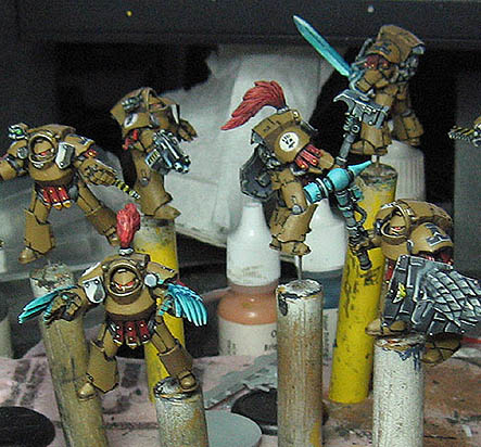
Work in progress: Pre Heresy Imperial Fists


Hey folks!  Here is something that I have been working on for a while, and it is getting close to finished.

It's a squad of those Forgeworld Pre Heresy Imperial Fists.  To begin with, there as a lot of "fixing" that had to be done with some unfortunate casting issues.


Then they were primed, and it was time to get down to painting!
You can see the earliest stages of the shaded basecoat under way.  The first image shows the base colors being put down, so that every part of the miniature had some kind of color on it.  This is important, as you have all heard before, so that you have something to compare your lights and darks against.  If you left everything white or black primer, and painted only yellow next to it, that is going to mislead you on your shading down the road.

In the second image, I have started to lighten up various areas with that very controlled drybrushing, which is more like "dampbrushing" :-)


These images show the lightening process taking place on every surface, every color.  The reds, turquoise, etc.  I am leaving the yellow alone for now, as those hard to reach areas mean that I keep hitting the yellow areas with my lighter shading!


At this stage, I put the stripes on the chainfists, and indicated where the little areas of gold will be.


It's just about time to start shading everything darker.  My first task is to take a dark brown and put some dark lining into the deepest recesses.  This is also done in the eyes, and on the undersides of the torsos, arms, and feet.


Now the fun begins!!  I took my glazes and began to shade everything darker, starting with all the weapons, shields, and other grey surfaces, such as the back of the torso.  You can see that I also began to rough in some freehand, such as the shields (I wanted 3 different designs on the 3 shields), as well as indicating where the insignia will go...


I continue the shading process with the other colors, such as the reds and the turquoise.  You can also see that some of the freehand has been develop a bit more, especially on the shields.  I also developed the Imperial Fist insignias a bit.

Some basic shading is also being done on the yellows, as I establish the darkest darks on the armor (basically a chocolate brown).


Now I start to refine some of that shading by working back into the middle tones, on the turquoise in particular.  This is done somewhat transparently by mixing in some glaze medium with the paint.  I love doing that!!!  I am even starting to put in some lighter yellows.


As I continue this, my main focus will be on those yellows, and making them lighter.  Once that is done, it will be time to do all the battle damage and rust effects, like the other PH Imperial fists.  If you want to see those, you can find a whole slew of posts on the left hand column under Imperial Fists!  The bases are also in a "how to" post.

This "shaded basecoat" technique is the cornerstone of all my techniques, which is why it is the first painting video of the Painting Pyramid Kickstarter!


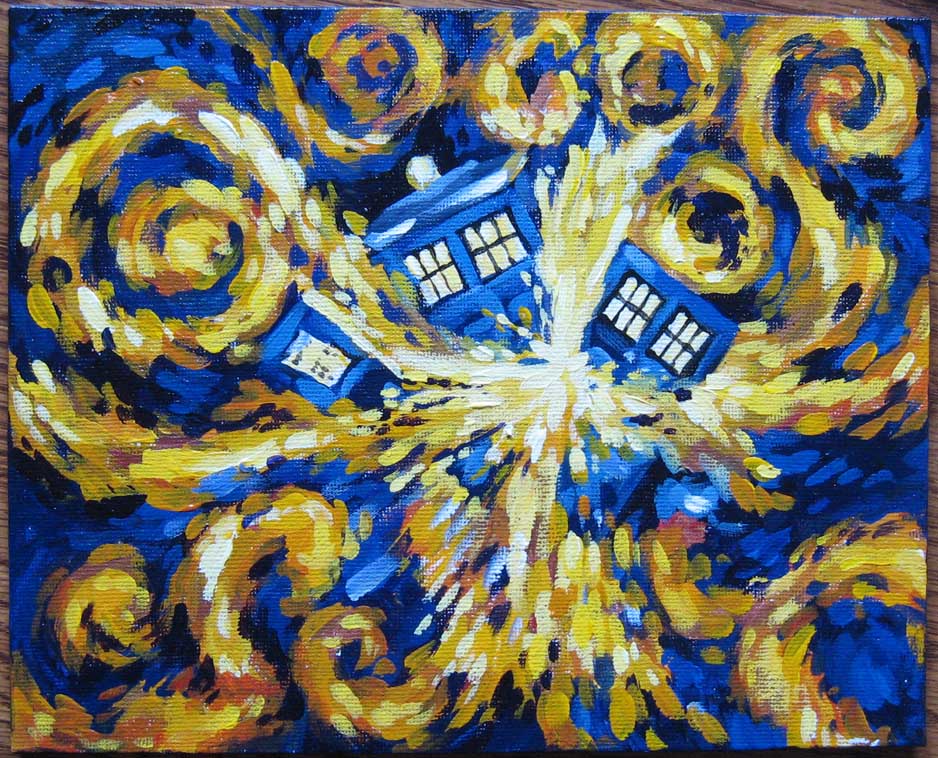
How to blow up a Tardis...


As you loyal Wappellians know, I don't often get the chance to paint in two dimensions!  

This was a very unusual painting for me, since it was in a style that was definitely not mine!  The one time I do a 'regular' painting, and I use an entirely different method.  Go figure.

There have been times where I have, in the course of my miniature painting, been asked to replicate the styles and techniques of other painters who had worked on previous minis as part of a big project, and so on.  It's never easy, since you have to try to discern what they have done, and how they did it, by strictly looking at the final result.  Again, never an easy task.

I knew this would be a very interesting challenge for me!

Things got started with some yellow, yellow ochre, and a little Cadmium red (makes if go fastah!)

Working quickly, and with one of my worn down #8 miniature brushes, I set down the darker reds and oranges first, and worked up to lighter yellows...


Look familiar?  Sometimes, the more things change, the more they stay the same. :-)


I worked the yellows even lighter with the introduction of some titanium white, trying to keep that 'layered' look, but avoiding the temptation to smooth out and hide every brush stroke!  I had to constantly remind myself not to do that.


Now it was time to get some of the darks in here.  I had some deep purple, cobalt blue, and cerulean blue.  You can see more of the lighter cerulean blue in the Tardis, while the purple was used in the 'sky' portion.  This was important, since the purples in the blueish sections would mesh a bit more with the reds of the spiraling flames...


Almost completely covered.  You can see that I used 'negative space' painting around the spirals, meaning that I painted around those lighter areas with my dark colors.  This is actually a watercolor technique.


OK!  Time to work on that Tardis!  I mixed in some white with the cerulean blue to pull out the door shapes, and worked on the windows.  I did make sure to get just a touch of yellow into all that, to keep the white from being chalky, and to reflect the explosion a bit.


I went back into my red/yellow mixes to blend in the spiral flames with the darker purples.


Here I put in some more sharp dark edges in places to define the explosion a little more.  I wanted the hardest, sharpest edges to be in that center of interest.  This can (and should) be done on miniatures as well. I always try to establish "focal points" such as these.


A little more blending, a little more light yellows added to the firey spirals.


I work some more lighter blues into the sky portions, creating a little more depth, and following the directional strokes of the yellow/orange spirals to reflect and enhance that motion.


Some more lights introduced in various areas for interest, a coat of gloss varnish, and POOF!  Exploded Tardis, Van Gogh style! :-)


Friday, January 18, 2013

Painting your Rivet Warrior: A step by step


Here is a little 'how to' on painting one of your Ally Rivet Wars miniatures.  I started out with the usual prep work, and got them on pins...


I want to emphasize that I tried to use as limited a palette as possible to paint this, so that it was a little easier to absorb the information!

It was then primed with Vallejo Nato Green primer.  My first layer of paint was Reaper Field Grey, but a typical olive green could be used instead.


These images show the figure as I mixed in some Reaper tan, little by little.  I was using a #4 flat acrylic brush, by the way, with relatively dry paint.


I did't want to focus in on just the uniform, so it was time to work on the face.  I took some Vallejo brown rose and mixed that with a bit of the lighter field grey/tan mixture, so there would be more color consistency. With each layer (still working with that flat brush, by the way), I introduced more of the rose.


I used some dark brown for the hair, and then added some Vallejo parasite brown.  The lights were created by adding some of the reaper tan.  I added some lights to the face by mixing in some pale flesh with the brown rose.  The leather items, such as belts and cartridge cases, remained the darker brown.


Once all the areas have at least gotten a few layers of colors, I start to work in the final highlights.  This is done on the helmet, the arms (shoulders), the face and the hair.  Some lighter colors are added to the leather surfaces by mixing in some tan with the dark brown.


Here's a closer view on the highlights, and a bit of the gun.  I mixed Vallejo intermediate blue with highlight USMC.


Now for the most important part.  The eyes!  I tried to make sure that the areas around the eyes were somewhat darker, so that they would stand out.  These faces are tricky, for obvious reasons.  You are trying to superimpose one shape onto a completely unrelated shape, so you have to 'fudge' things a bit.

Once the whites of the eyes were placed, I put in the iris, and then painted the upper eyelid.  I mixed a little of the dark eyelid color with the brown rose, and shaded under the eyes.  I then highlighted the iris with a dot of white


The eyes are big enough to put color in the iris if you wish, and even paint in a pupil if you want!  However, this image is about the little insignia, and the rust effects.

I took a brown/blue mix and painted a few paint chips around the edges of the helmet, as well as the top.  The 'bottom' of these paint chips are highlighted with a tiny bit of tan, while the 'upper' edge is shaded with black.  I painted some rust streaks using that Vallejo Parasite brown.


Here's the base.  Basic grey with a blue/black shading wash.  The rust was done the same way as the helmet.


Here he is!!!


I will be filming the painting of one of these as yet another test video for my painting kickstarter... go check it out!