Thursday, March 24, 2016

Grey Area


Here's one of a few figures that I painted as part of a lesson plan.  These were test figures to not only use as an example, but as a "muscle memory" exercise to allow me to focus on translating the information, as opposed to concentrate on painting the figure.


That needs to happen on autopilot, as I learned many years ago when I did watercolor and pastel demos.  I would practice the painting several times, so that I could set up things like "mistakes" or other "need to know", "by the way..." situations.

Those are far more helpful in the long term for people than you might think.  Years later, I would have people tell me that I saved them countless dollars in pastel paper, as they no longer threw out their half completed works in frustration, or because they had gotten too adventurous with their choice of paper colors :-)


Also, time is crucial.  Any demo that drags on forever will cause any of us to wish we were dead, so keeping things crisp and snappy at all times is important.  That's not always possible, but even the awareness of such things can be helpful!


Finally, one hidden aspect of showing people how to the process works often means that you are facing the figure to where they can see it.  That means a very awkward angle for you at best, nearly invisible at worst!

That can be the toughest aspect to deal with.


Red Champion


Not quite done with winter yet!

Here's an interesting champion character from Red Box Games.


I do enjoy the way the bandoleer of skulls meshes in with the fur cloak! :-)


The armor plates are roughened up enough to do some interesting weathering tricks on them, but yet still reflect a bit of the sky and snow for some blueish tint.


Wednesday, March 23, 2016

Steel Skies


Here's a piece that I have been itching to see in photos... the first of the French self propelled Anti-Aircraft guns.

While these were first created in 1913, I believe, they were among the premier AAA weapons prior to the war.  I remember reading that it was the first time that stabilizer bars had been used to prevent some obvious issues!!


For those not familiar with the scale of Flames of War, this is 15mm.  The base stand is not even the size of a business card.


For the foliage, I switched to some old Woodland Scenics trees, using the smaller scrap pieces which remain from previous projects.  I also went with static grass.

As a practical matter, I have a lot of these stands, and not so many grass tufts!  I do have a lot of 'regular' static grass, so I think I'll be using that for most of these stands.


There is one advantage to the old fashioned static grass... it's a better scale for 15mm!  I was concerned that the grass tufts were simply too huge for these pieces, especially when the tiny soldiers got lost in them!


It had been a long time since I had applied static grass!  I forgot how messy that could be.


Here's a comparison with one of the 1897 heavy guns!

Stay tuned... much more firepower on the way...


Touchdown!


This very happy guy is a score marker for the Samurai Orc Blood Bowl team.  It seemed to be very appropriate, on many levels!

It was a resin figurine that someone had given me.  His hand was broken, but I was able to fix that.  I decided to paint him like a stone statue (the original paint was a flat gold).


As usual, I tried to vary the colors as much as possible, in particular over the broad open surfaces.  The cracks were put in at the very end, because I thought it needed a few little touches to break up these areas.


As you can see, I tried to incorporate as many greens as possible to give it more of an aged look, as well as some staining.  The color choice was made when I primed the figure, mixing a few different colored primers together.  I loved the color which emerged so much, I decided to continue on in the direction that it set.


Tuesday, March 22, 2016

The Archon Arrives!


This was the most elaborate basing that I did on any of the Venoms.  Since it was the Venom for the Archon and the Incubi squad, it seemed appropriate to make it extra special!

It was an homage to a strange sculpture in front of Midway airport, which we have always referred to as the "Crashed Plane Sculpture".

It looks like the aluminum tail of a jet liner sticking up out of the ground at an odd angle... eerily resembling a crashed plane!

Me live very close to the airport, so 737 jets scream over head all day and much of the night.


The markings on the tail are from the Space Marine splinter chapter against which this army is fighting.  The army display board also incorporated bits and pieces of tanks and other craft such as this to continue that theme.


You can see all of that in the Dark Eldar section of the blog.


I also had a lot of fun with the freehand designs on the Venom itself, adding some icons on the banner as well as the same freehand hull patterns.


These views give you a better look at the hull patterns.


Overall, it was a very fun piece!!


Monday, March 21, 2016

It came from the Bog!


Meet Morannach, the dreaded Bog Monster from Mierce Miniatures!

Here is a side by side of the miniature with the original concept art.  It's never easy matching up the two things, because the artist is working with an entirely different backdrop and other parameters.


He's a hefty beast, made of mud, branch, leaf and skulls!  He is on a base that's 75-80mm wide, so that gives you an idea of scale.


I had lots of fun with the color transitions... greens changing into yellows and browns, etc.  It was important to get some of the blueish gray elements in there as well, to act as a bit of a buffer to some of the higher saturation colors.  I did most of those on the legs or the lower sections of the monster.


The views from above give you a glimpse at the boggy base, as well as the stones and other upper level surfaces.


There were so many branches everywhere!  I had to set this one aside every so often, so that I would not keep painting the same colors all the way through a given area.  By stopping, I would be forced to "lose track", and then start up again in a completely different spot.

Yes, that might be considered counter productive... and it normally is.  However, it worked out as I had hoped. :-)


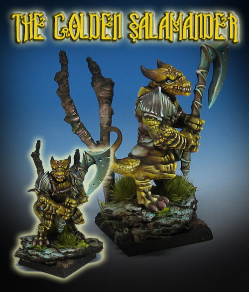
The Golden Salamander


Here's another color take on the Kings of War Salamanders.

I started with a much more traditional greenish color, moved to a red, and now it's time for some gold/amber.


This was going to be a very fun color contrast to the rocks and the weapon, since I knew there would be more teal and purple there.  Reflecting a tiny bit of the amber onto that blade was going to create some dramatic shapes to be sure!


Still, I wanted to incorporate some reddish hues, so that the golds would be tinted towards amber.  You might see in the right hand image that the yellow is more of a green hue.  Again, it's all about creating as many different subtle color transitions as possible to make it more interesting to look at.


That was also going to tie in the 'skin' colors with the weapon and the rocks, even the shoulder armor.


One last view to show the overall scene.  While I have also painted entire units of lizards the same color, it is a lot more fun to experiment and play around with those colors!