Tuesday, September 16, 2014

CHIPS... Lawmen style.


So, we have some finished pictures of the Lawmen Interceptor.


These will be a relatively simple set of colors, as I am trying to get them ready for learning the game.  I will get a bit fancier with the Holy Orders and Warrior Nation figs.


Still, I had a lot of fun with this, and the bases have been a real blast!


These views from above give a good sense of how they it interacts with the miniature.


Let's ride!!!


Don't let yourself get rusty


Fun time jars on the palette!  Glazing the DragonForge bases.


A blue/black mix is the order of the day for the deck plating...


Aside from wiping away the glazes in key spots with a dried brush or my fingers, I will keep some extra soft tissue around.  This blots away the excess glaze and even leaves a next texture behind.


You can see the difference just one shot of the glaze can make on the metal parts.


These were some pretty huge areas to cover though, so I had to work very quickly!


I think this shot shows you how much color variety I try to establish as I continue with the glazes.  Not just brown or black.  I have some green in there, some reddish brown, and so on.


This image shows me blotting away some of the edges of the applied glazes with a dried brush.  I can get some interesting lighter and darker transitions in this manner.


I will also use Reaper liner paints in my glazes... especially where I want some very rich, deep darks.  Here I am using a mix of brown and blue liner paints.


That just about does it for glazing and tinting!


Which meant it was time to finish them off with a bit of rust!


Monday, September 15, 2014

Shading the Interceptor


With the glazing and shading completed, it was time to start working back into those middle tones that you hear me harping about!

It is during this stage that I pick out more precise colors... in this case, putting more blueish grays in the metal areas.  I even mix some of my glaze colors into the regular paint, which makes it more translucent.  That means that my previous shading will show through!


It was also necessary to get the glowing red areas involved as well.


So much of the interesting colors and shades are included in the middle tone areas.  Granted, they must be very subtle, but it adds a tremendous amount of depth to your overall shading.


In effect, you are 'sculpting' the shapes with these layers.  You can see more and more detail and depth emerge.


This method also allows me to make adjustments on the fly.  I have the option to take the 'final' colors in a different direction from the original plan, since these are such subtle layers, and I am working only in one section of the value scale, not the lights and darks.


Once he was on the base, all the color choices start to come together.  The final pictures will be next!  Stay tuned!


Sunday, September 14, 2014

More from the Forge


Time to paint some more bases for Mechanicum big guys!  These are also from DragonForge Designs.


If you are familiar with all the other Mechanicum bases, I have tried to keep the same set of colors working on these two.


This means having a balance of reddish, green and even some yellow hues in the stone areas.


In typical Shaded Basecoat fashion, I went a little bit lighter to make 'space' for the later glazes.


To get some color contrast with the stone areas, the metal plating was immediately painted in a blue/gray.


You can see the "light to dark" transitions, especially on the right hand base.  It also contrasts a bit with the light areas on the 'warm' colored stone.  Light against dark.  Creates interest!


Still working lighter, but now putting in some 'warmer' grays... even in the metal areas.


Working lighter still...


A few colors on the wires!


At this point, the Shaded Basecoat phase is nearly complete.


Which means I can toss down some food at the workstation and actually see a play or two of Today's games.  Then it's right back to it, and the glazing/shading.  Stay tuned!!


When you fight the Law...


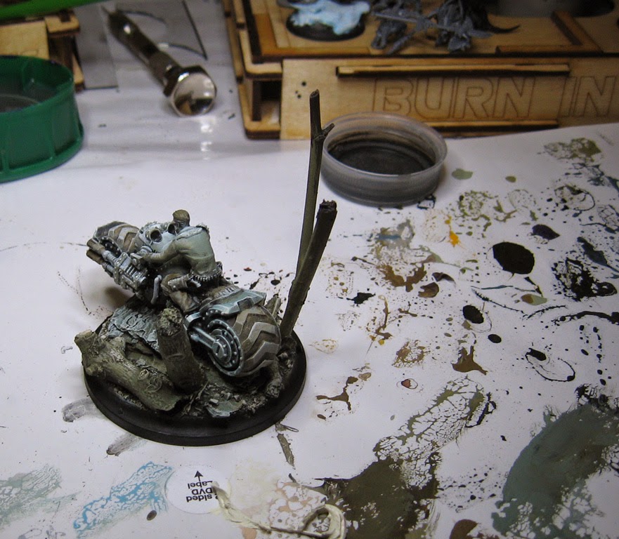
While working on other things that were using a similar set of colors, I thought I would get some paint on the Lawmen Light Support so that Rich and I could continue on the learning process of the WWX rules system!


This is what the vehicle and base looked like right after the Shaded Basecoat phase.  As always, the idea is to establish as quickly as possible where the lights and darks will be.  It's also supposed to set up all the subsequent glazes and shading.


Precision is not what I am after... it's about blocking in some general colors, keeping it as simple as possible!


Even though most of the values are far lighter than they will eventually be, you still get a sense of how the value pattern will play out.


Yes, they're back!  Secret Weapon Washes at the ready!


The usual suspects out on the palette, ready to shade the base.


And then to the bike itself.  Once more, I am trying to tint colors and shades as well as darken them.  To do this, I make sure that the glazes change color and tone as I move quickly across the figure.


The parts that I thought might be metal were hit with blue/black washes, while other sections got much warmer colors.  Keep in mind that doing several layers of glazing to get to your darkest dark is key.  It does not take much time to place all those translucent layers... not like many opaque layers :-)

Stay tuned as I work back into those middletones!


Saturday, September 13, 2014

Flying High!


So, now you get to see what the first experimental base was for!

This is actually a Lord of the Rings eagle, from the Hobbit series.


It was mostly painted a while back, and I thought it wold go well with the current set of experiments.


Obviously, the trick would be in positioning this bird.  The center of gravity issue would be critical!


I hemmed and hawed over how I would attach him.  The original intention was to have a tree branch come right next to the body, and it would create a natural attachment point.


I didn't want to do that this time around, so I chose a paper clip.


By the way it is positioned, there are very few views where you really see it.  The idea is still about speed, and messing around to much with the attachment point would be counter to that cause.


I also wanted an interesting ad dramatic angle.  This is very close to the vision that I had when I began.


He is actually very solid, and the center of gravity is perfect!  I was very relieved.


All of the colors are very subtle.  You can see now why I was using so many grayish greens on the base!  I used far warmer colors on the eagle itself.


I concentrated on more intense yellows and reddish browns.  I also make the yellow on the feet as intense as I could, contrasted with a bit of deep purple in the talons.


Finally, I used  a bit of realistic water effects on the talons and beak.  I have found this to be a nice way to show a texture difference with the feathers.


This all came together very nicely.  I was very happy with the final result.  There are many more flying things like this on the way!


In these next few views, you get a better look at some of those warmer colors.


This view shows them contrasting with the grays of the base...


As does this third view from above.


Even this ground level view reveals the green vs red contrast.  I hope you like this one as much as I do!