Time for some more images of the gargantuan 6 pound dragon! As I mentioned in the first post, much of the initial layers were done with a Badger airbrush and Stynlrez primer. Not only are there 12 colors of primer, you can expand these even more by adding some Ghost Tints.

I also wanted to mention the basing, which was a wooden plaque with some carved pink foam bits added to continue the original BONES base across the lava.

I added a bit of texture to the foam to match the original pieces, and once that was painted, you could not tell the difference!

The same Vallejo Fluorescent paints were used on the base, in combination with the Reaper Clear and Liner paints. The yellow clear mixed with the orange fluorescent worked well for the lights, while darkening the orange with the Clear red and Red Liner paints made for some expanded value patterns in both the lava and the scales.

One thing to keep in mind about the fluorescent paints is that while they are pretty thick, they are very translucent. This is what gives them the extra brightness. There are absolutely no opaque properties to the paint.
So, you can almost apply this as a "glaze", even without thinning the paint at all!

I used this as an advantage as I was able to use my larger brushes and spread out the fluorescent paints very rapidly over rough surfaces. While it was not a dry brush at all, the result was similar in a way. However, I was not left with the usual scratchy/patchy brush marks that normally occur with true dry brushing.

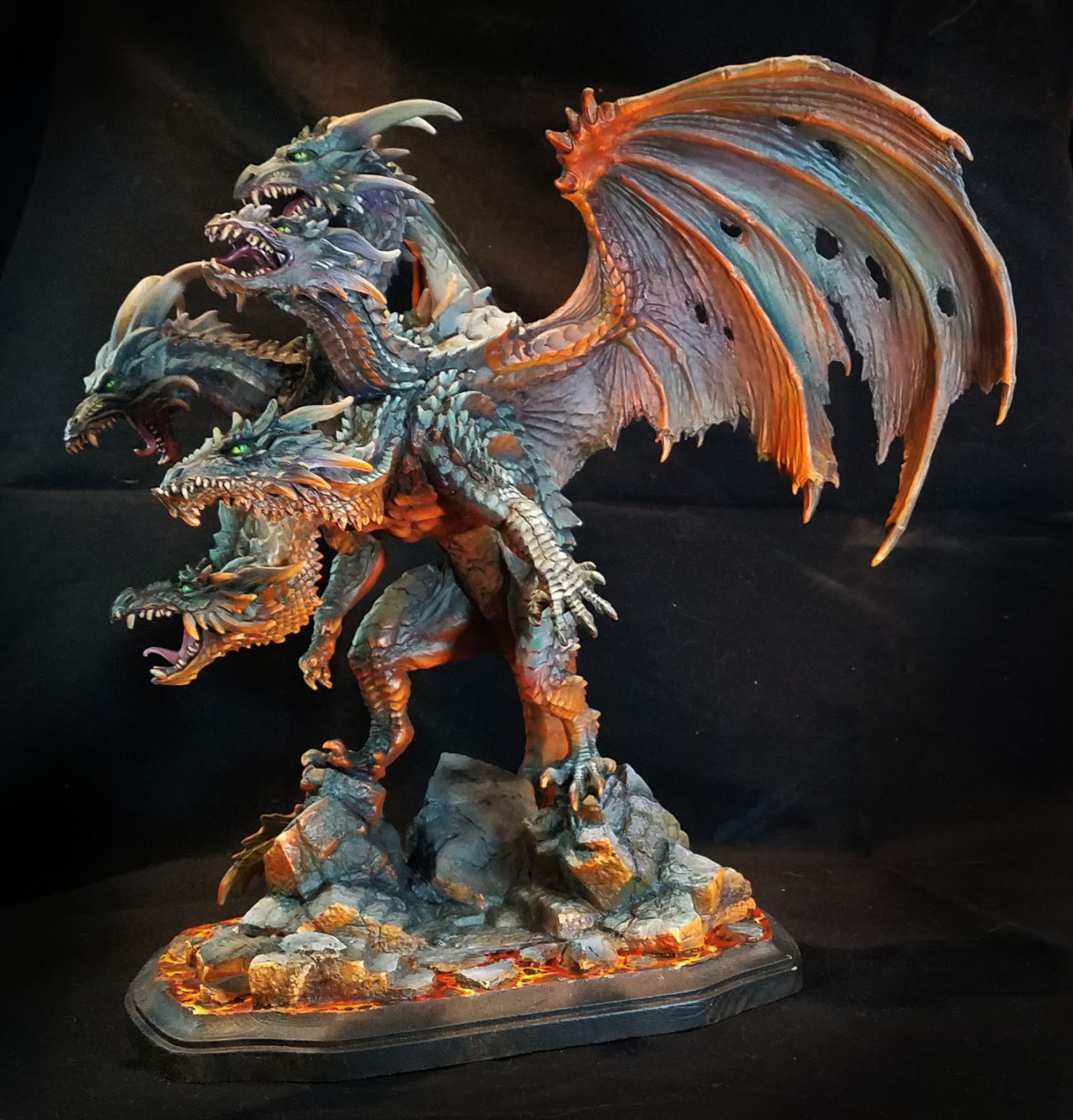
I ended up deciding on a bright green for the eyes. This also had to do with the "color harmony" that I mentioned in the first post. Most of the grayish mixes were created with Clear green and Clear Purple mixed with a lighter color, and having the eyes be a mix of Clear Green and Yellow meant that the lava and the grays were being tied together in a way...

The reason I like to make my own ray mixes is that I have far more flexibility in how they are tinted. Having a little more purple in the mix means that I can have some very nice grayed down tones that will appear more purple when you look at them more closely.
I love grays so much, I made it the subject of one of my five Painting Pyramid videos called "Shades of Gray" of course!

If I had more green in the mix, that became a very nice contrast to the deeper reds of the lava reflections. This also meant that I could have a bigger range of grayish colors on the faces, giving them a little more depth than simple lights and darks.
Deep purple shadow colors against lighter greenish grays makes the faces come alive, as opposed to looking like a colorized photo which has light and dark, but no real color variance.

I hope that you have enjoyed my little discussion on colors here... that is as much fun as talking over the "Arc of History", and I will go on and on about it to anyone who will listen!
Stay tuned for much more!