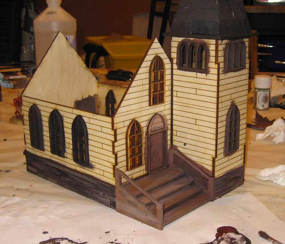
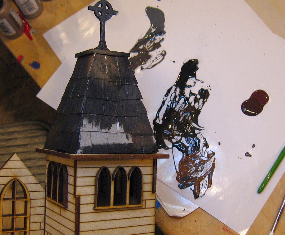
Here's the rest of stage one for the Burn In Designs church. As I mentioned last time, this is essentially Shaded Basecoat for terrain.
This means that I want to get every surface covered with some kind of color. Doing so provides "context" for each color, and prevents something from being painted too light or too dark. That can happen when you only focus in on one small area, and you have nothing near it for comparison!
So, I am starting out with the darker foundation rocks. I am trying to incorporate some grey in with the reds and browns.
You can see how that plays out here in this stretch. Since I am working very rapidly with larger brushes, I can blend right on the surface! So much fun :-)
To get a little separation from the foundation, the steps will be tan and grey. Subsequent layers will have a hint of green as well.
Getting paint on all the window surfaces takes a bit of time. You really have to jam the brush in there to get all the surfaces covered. While some of this will get painted over when the walls are painted, that's OK. It will be a lot easier to touch those up, and they still need their own highlights later in any case!
For the interior walls, I want a bit of an aged plaster look. I have an ivory white and a few different types of deep brown... more like a Van Dyke brown for you watercolor fans out there.
You can see that I have my usual concoctions on the palette.
This area will require a lot of "on site" blending, where I will place colors on the surface and scumble them together with the brush. The wood is absorbent enough to soak in the paint, but not too much where it will prevent moving that paint around once applied.
Generally, I tried to focus the darker grays towards the top of the walls, possibly indicating years of candle soot.
Interior walls almost ready for plaster cracks, wall sconces, and a wooden cross that I am working on.
At this stage, I just want to get a general light color on the exterior walls while the inner walls dry.
I used a large, chisel edge flat brush to work around the window. Again, no need to worry about hitting those with paint.
I will be going over the outer walls with subsequent layers of paint and powders..
The interior. These are the warmest colors I have used so far... way more yellow than anything you have seen. I am trying to get a little bit of color distinction here.
To get even more color splash inside, I think I will be doing lots of blood spatter and pools inside. This will really indicate just how rough the town of Wappelville can get!
I might even paint a few bullet holes in the wall. :-)
The earliest stages are now complete. From this point, I can work to establish more contrast and definition, as well as weathering and other special effects. Stay tuned!!!


