Wednesday, July 30, 2014

A new Favorite is found


Here are some more types of backdrops.  I knew the red one might be a little too much, but I just had to see what it looked like!


It's still fun, because it does create an interesting theme.


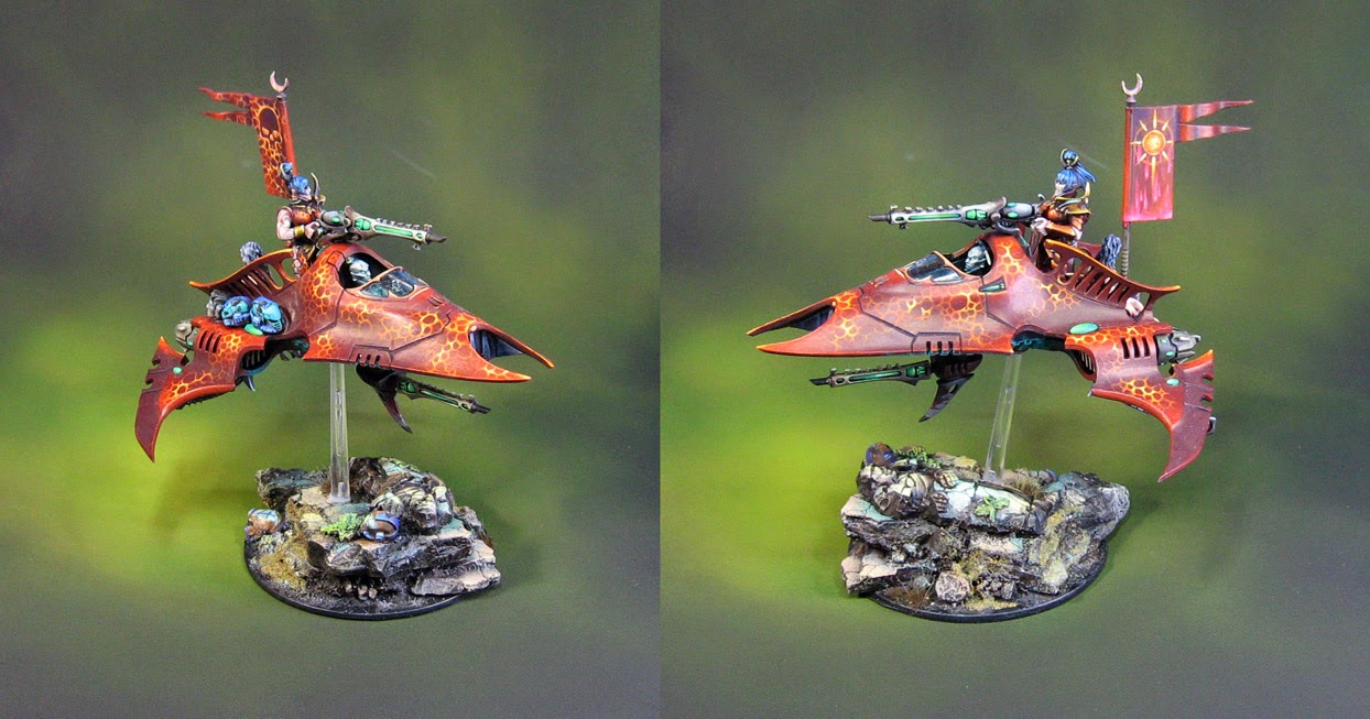
Now for the crazy one!  Trying it on green this time.  I thought this would be really crazy, but once again, I wanted to see what it looked like.  It does emphasize certain colors, that's for sure!


Now this one is my personal favorite.  While I will always trend towards the blue/white fade, this one seemed to be the most balanced.  It didn't burn anything out or make something invisible, and it set off the red nicely.

The heavy mottling of the backdrop is very helpful.  The infusion of the purple/gray is great, while the warmer tans keep the reds from going too bonkers!


So, I will continue to see what the other ones look like!!!


More testing of the backdrops


It seems like just about every army I have made has been very difficult to photograph... mostly due to lack of backdrops.  As you know, the Hangar 18 solution came along, so I am attempting to fix that issue! :-)

The flyers and skimmers of the Dark Eldar army presented an especially tricky problem.They were taller, wider, and more complicated in terms of color, freehand, and sheer amount of stuff going on!


Heck, I was happy enough just to try out the blue/white fade on these.  A vast improvement over the original dingy piece of drawing paper!


As usual, this is my 'classic' method of photographing figures.  There is a reason why most industry types went with this initially, since it does have a tendency to show all the surfaces of the figure in a more neutral way.


Once you get into the colors on the backdrops, you will have one aspect or another emphasized a little more.


I took images of this vehicle against several of the backdrops to see what it would look like!  I have two here...


The dark blue backdrop.  Three more tomorrow!