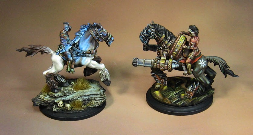
OK... here's something a lot of folks have been anxious to see.
This is the other half of the zombie queen set from the Confederate Rebellion, one of four new factions being created with the Wild West Exodus kickstarter.
This is an interesting shot, as it shows some critical elements.
First, the concept art which must be matched. Doing so is always a challenge, since the final sculpt is always different, and you don't have the benefit of a 'backdrop'. This can effect the appearance of a color far more than you might think.
Also, for those of you not familiar with my Shaded Basecoat technique, you see my #8 round craft brushes ready for action! Each is in a different state of wear.
The more worn out brushes are used to make the initial applications of color, as the point has been worn away, making a nice version of a filbert brush. The newer, more pristine brushes are for more detailed areas.
Let's begin I chose a generic grayish green color for the scales, which was lightened with a rotting flesh type color. A mid tone brown was used for the bindings, and a light grey for the metal parts. As usual, the Shaded Basecoat begins light, and then gets lighter.
This will be shaded and tinted by subsequent glazes.
And let the Glazing begin!
I use a huge variety of glazing colors... Secret Weapon, Vallejo, and so on.
The approach here is similar to a watercolor painter... in that I concentrate my glazing in tightly controlled applications.
This is normally something I use in my Nurgle mixes, but the swamps demand the addition of this high chroma light wash. I will mix it in with the Algae for some extra boost.
You ca see that I am working around the metal areas and the bindings.
A substantial difference already!
I have made sure to vary the colors of my mixes... some parts were more brownish, while others were more yellow or blueish green.
It is a lot easier to get this kind of color variation through glazing and tinting as opposed to laborious opaque color mixing.
So, the scales, which had been painted a very basic green color, could be turned warmer or cooler, brighter or more muted, with just the type of glazing color I was using.
The same technique was used on the bindings. I was even able to incorporate some of the green glazes into the mix, which unified the colors... keeping the browns from getting too out of touch with the green of the scales.
Also, I can apply multiple glazes to a given area to darken it further, or tint it, etc.
A blue/black glaze was created for shading the metal pieces.
Now we have some decent shading, which can be refined much more with semi-opaque applications in those all important middle tones.
These techniques are so central to everything I do, I made sure they were the first two videos created for the Painting Pyramid series of instructional videos.
I like to think of them as the steel framework of a skyscraper. It provides a lattice upon which I can 'hang' sheets of special effects, such as the RJ-1027 glow, and the Blood spatter!
Stay tuned for the Grand Finale!!!!!


