Monday, November 17, 2014

Keeping the trains on time


We return to the Wappelville train station from Burn In Designs.

The original station of 50 years ago was white with green trim, so this one would be as well!

I had to do the window and door trim first, which was unusual.  Normally I would paint that the other way around, but there were many textures to deal with.

Also, I wanted to do the window trim while the interior was still wet.  This way I could take a brush and blend in any over bleed.


I mixed a deep green and a dark brown for these initial layers.


I also used a brown and gray mix on the roof panels.


The green trim areas are pretty much set!


The outer walls were done using an off white mixed with a few different brown colors.  Keep in mind, there will be posters and then weathering powders added once all this is set!


Lighter greens were added on the upper surfaces of the trim panels...


Did I mention posters?

I did a few searches, and found lots of fun stuff!

Some of these posters will be used on other buildings, such as the general store, the hotel, and so on.

I was very glad to find the SouthSide rails image...as well as the maps.  Those are going on the interior.


A little close up on some of the posters...


Printed out, and ready to glue in place!


Reclaiming the Webway: Tron Style


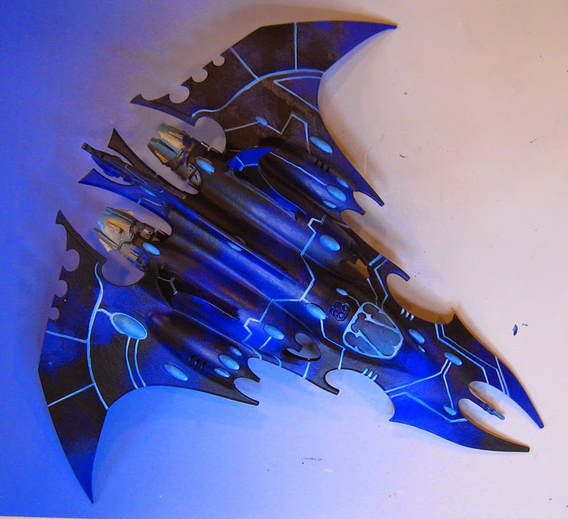
Yet another reclamation project for you all.  It's Dark Eldar once again, but this time the theme is TRON!

This was the general concept...


I had to do some experimentation, seeing what combinations of colors might work best, as well as what to do with some of the details and other effects.

That meant the cockpit, spirit stones, cowlings, and so on.


In the end, I chose a few high chroma blues... one lighter, one darker, and mixed them with a few metallic paints.


The idea is to use the larger filbert brushes, and work very quickly across the surface, so that I could mix the colors right there on the surface.  These color transitions are not supposed to be very noticeable from a distance. 

In fact, they are meant to be overwhelmed visually by the final lighter freehand colors.


Once the various blues had been established, I mixed some black in with the darkest blue, and put in the darkest accents.  These would hopefully make the lighter lines pop out even more!


I mixed in a little fluorescent Cyan with a sky blue to put down the initial lines, as well as the glowing stones.


I enhanced the lines in certain places by adding progressively more white into each layer, but only in a few select 'contact points'.

I was playing a lot of "connect the Spirit stones" here. :-)


Much more will be added to this.  In effect, this is like a 3D sketch... I am testing out certain things, painting over what I feel does not work, etc.

Never be afraid to do that!


After about 90 minutes of roughly blocking in the colors, this is where we are at.


Many more hours of refinement will be required to get to that final result, but this was all about experimentation for right now.

I will be doing more on the various stones, as well as adding requested stars.  

Scorching will be added to the weapons and engine cowlings, and more tiny freehand details.


There will also have to be some decisions made on the style of basing.  It will have to be one that works across an entire army.

This could be done in TRON style as well... or as something completely the opposite of this very sleek and shiny color scheme.  Perhaps very dirty, rusty vehicle parts or destroyed Imperial structures. 

Such a style would certainly yield a lot of contrast!!