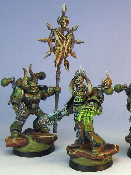
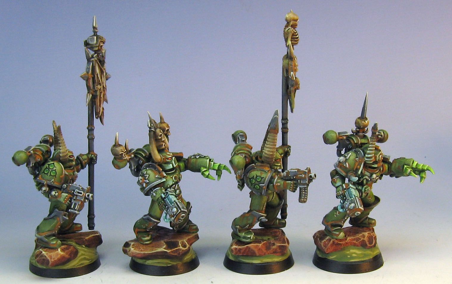
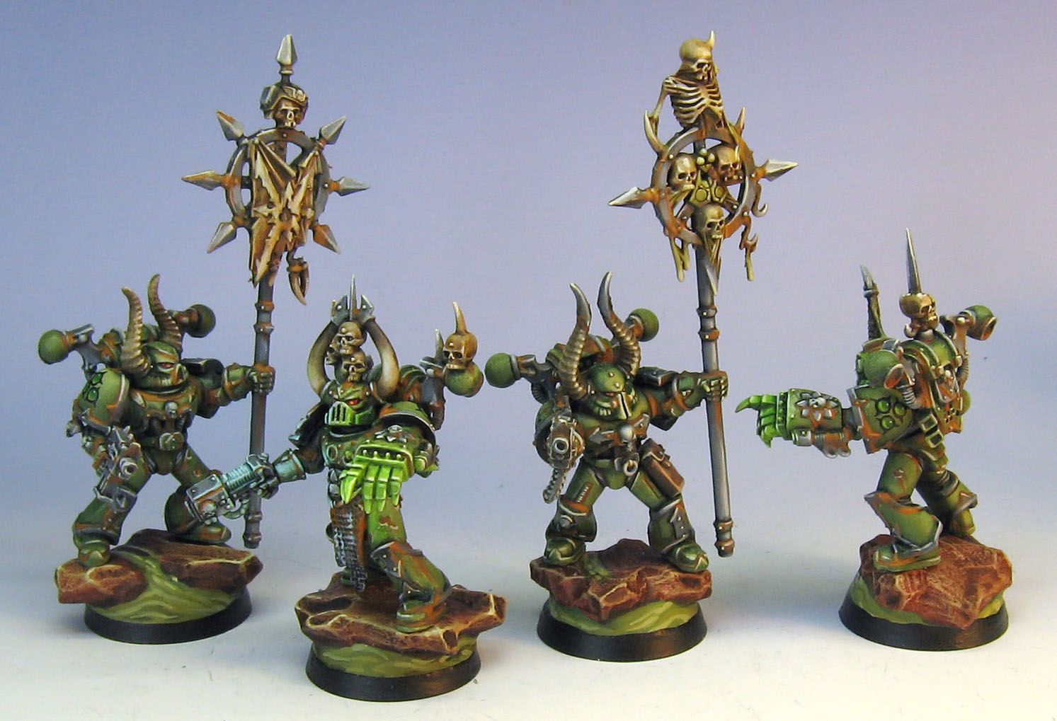
I believe these are the only Nurgle marines I have ever painted. It was lots of fun. I was able to use a much different palette than normal, and some different icons as well! The rest of the squad will be posted later when we get back home...
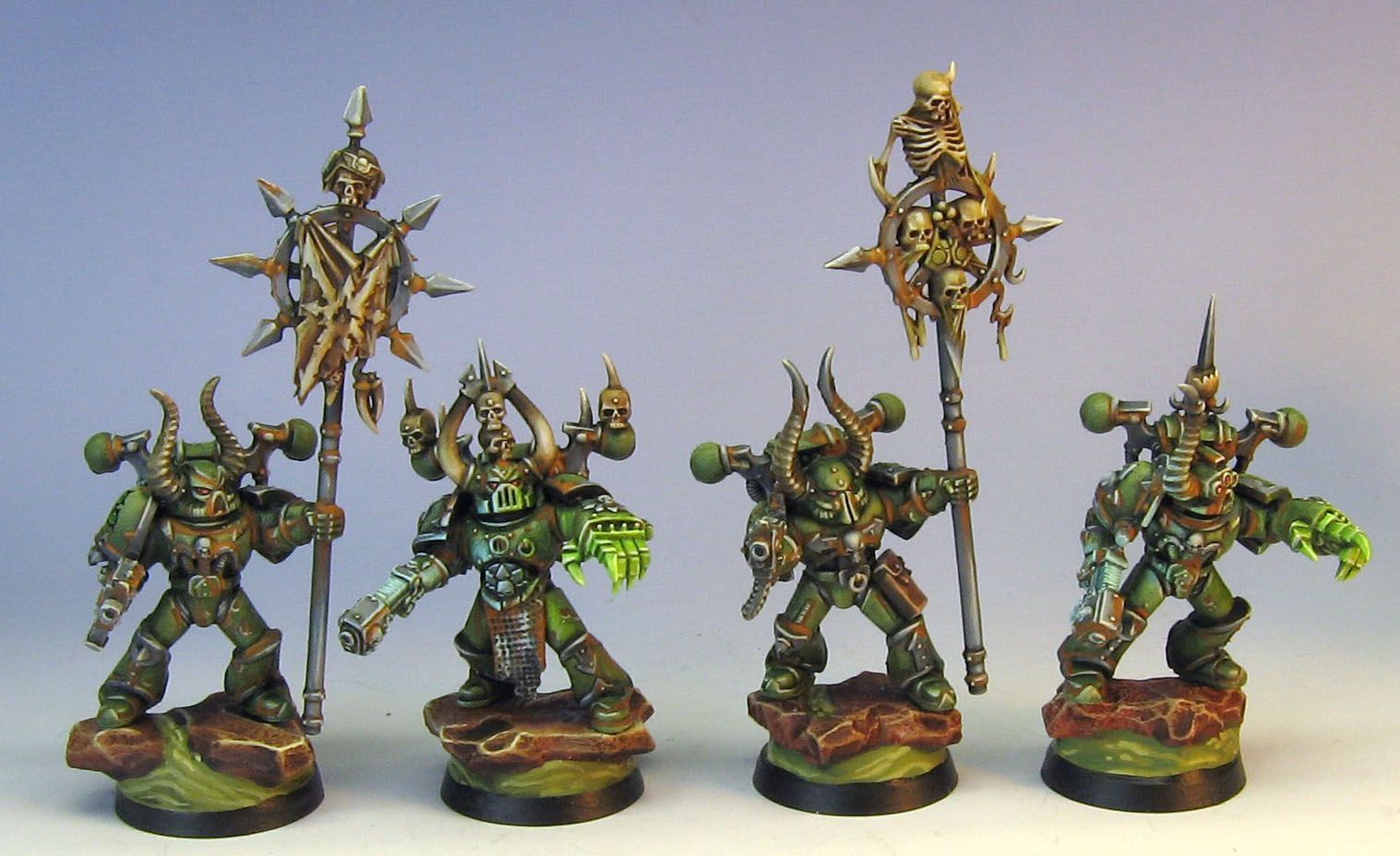
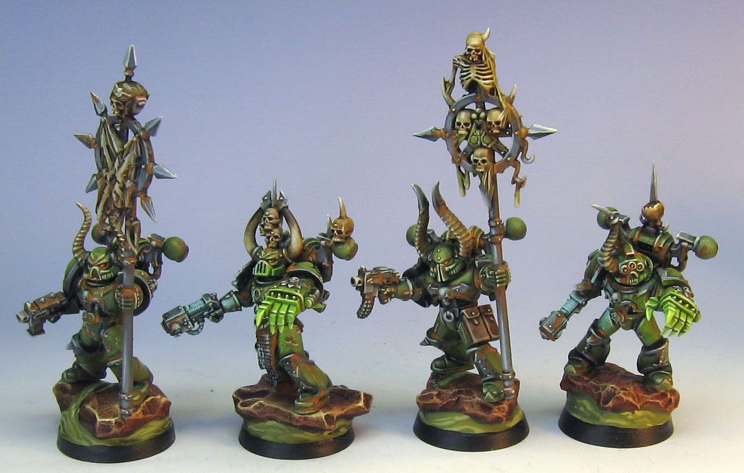
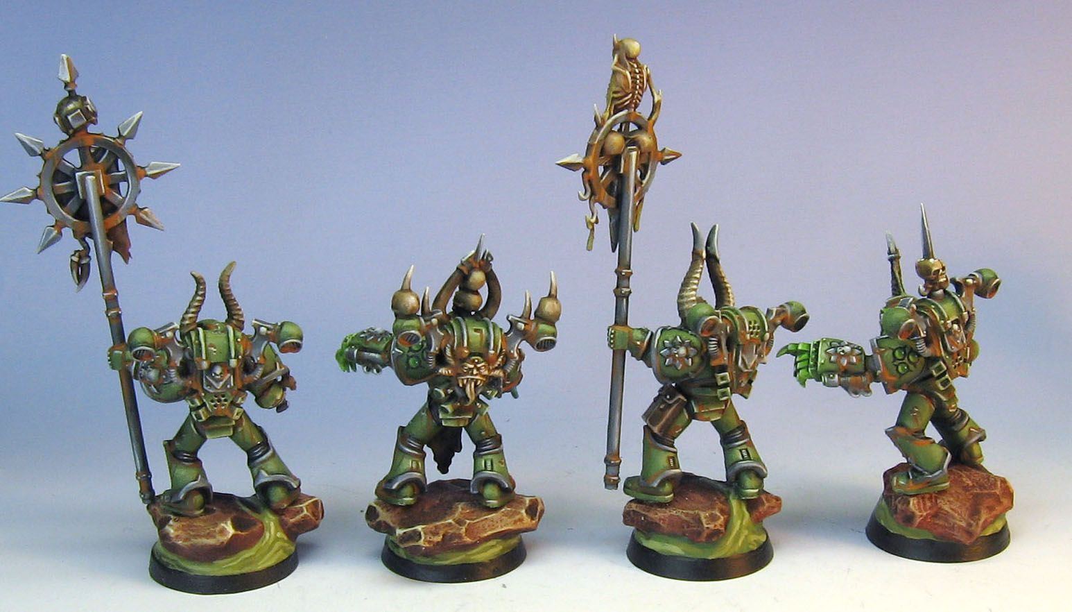
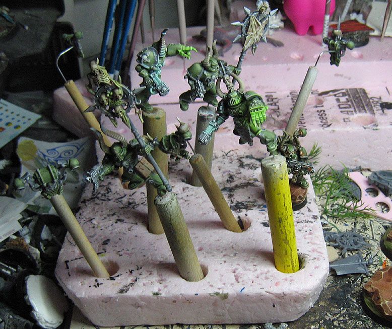
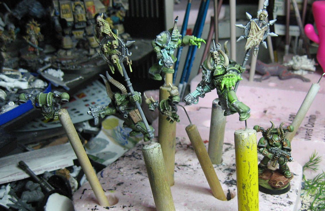
Here are a few WIP images that once again illustrate the idea of painting lighter, and then glazing and shading and tinting darker colors later:
Fantastic work Jim! I love the bases, they compliment the figure very well. I also like the free hand gems on the shoulder pads. Quick question, how do you do your gems. They always look 'gemmy' where as mine look sort of matt gemmy. What's your secret? :)
ReplyDeleteRory
Thanks!
DeleteI think it is probably all about the contrast, which can help it look more transparent. However, you have to manage the transaition carefully, since if it is too abrupt, that will blow the effect.
It even matters what you choose as your "light" color on the underside of the gem. It is best if that is a bit cooler than the upper layers, and even a little grayed down.
Placement is the last issue. If you can get the underside light to look like it is right in relation to the highlight, it really helps.
Speaking of help, I hope that rambling does! It was a log day of sun and sports...
James, do you have any use for some Citadel paints from the old range? I just finished a sizable commission and will be switching to the new range so that on my next project I don't run out of some old color or wash and curse like a sailor or cry like a baby while trying to color match. I'm asking my favorite bloggers first before throw them up on ebay.
ReplyDeleteZab
Thanks! I think we have enough of a supply here for a while. ;-)
DeleteI have been experimenting with the new color range as well, but not with the glazes and shades as of yet.
We do have a decent supply of the old colors, as well as a nice restock of Vallejo game colors as prize support from Adepticon.
When all the GW washes went nasty due to the overseas manufacturing, I had no choice but to abandon those for Reaper and Vallejo products.
I have discovered that the 'dry' paints can be used in many ways that have nothing to do with dry brush, though! I will try to get some kind of demonstration of that on the blog here...
I hear ya. I use many different brands too. I just need to get rid of these old colors before I dip a brush in them and then regret it when they run out. Love those new smurf vets!
DeleteZab
Love the colours here!
ReplyDelete(if you don't mind) what colours did you use to start and then glaze with?
Gee, I have no idea. But, if I were doing them again today, and only had the colors in front of me now, I would probably start with vallejo game color Cayman Green. You could also try the old foundation paint Knarloc Green mixed with a dingy yellow, perhaps iyaden darksun or even snakebite leather.
DeleteGlazing was a green/yellow to start, working to green/brown. Now that I have a sepia shade from vallejo, that might be a very nice item for glazing these colors.
I hope that helps!!
Cheers for that!
DeleteMy technique is improving, but finding the colour i want to use is still hard work.
When highlighting (before any glazing) do you just add white, or do you use softer colours?
I try to avoid white for highlights. Instead, I use things like ivory, rotting flesh, super light flesh tones, space wolves grey, etc. These are colors that are almost white, but still have some measure of color to them.
DeleteIt makes a big difference!
Thanks for your help! Much appreciated
ReplyDelete