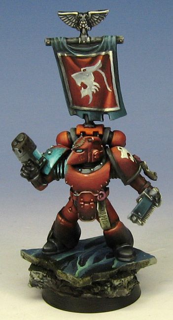
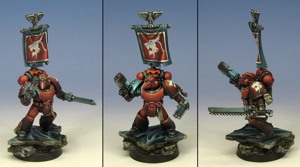
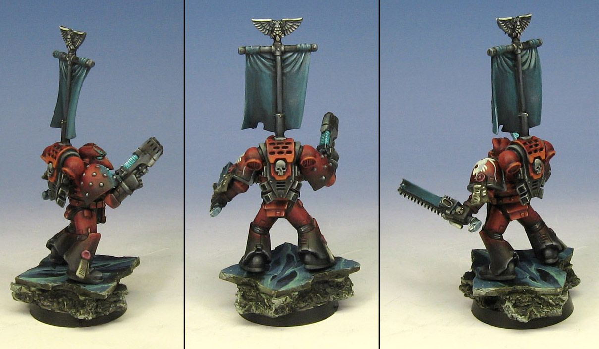
I still wanted to keep a slight hint of blue though, so the banner and base got a teeny bit of a grey down dark blue. The insignia is a neat one, so I look forward to incorporating that into lats of areas on the actual minis. :-)
A collection of images that feature my painted miniatures. It features many of my award winning figures and terrain pieces painted since 2001.


I cant wait to see the small force in this scheme! You blew me away with the sheer sexyness!
ReplyDeleteDude are you posting these as you paint them or are they older works as well. I imagine you as a kraken with brushes instead of tentacles...
ReplyDeleteJames is such an ocotupussy name right?
I think your grey could go a little cooler and to be a true inverse shouldn't the red be painted metallic style?
this is a very cool look James - I REALLY like it. I agree too that the grey could go a little more towards cool/blue - have you tried p3 coal black (handy colour that) and it looks as though you got a flake of something in the insignia on the banner.
ReplyDelete