Sunday, September 16, 2018

Scale and Fire: Part 2


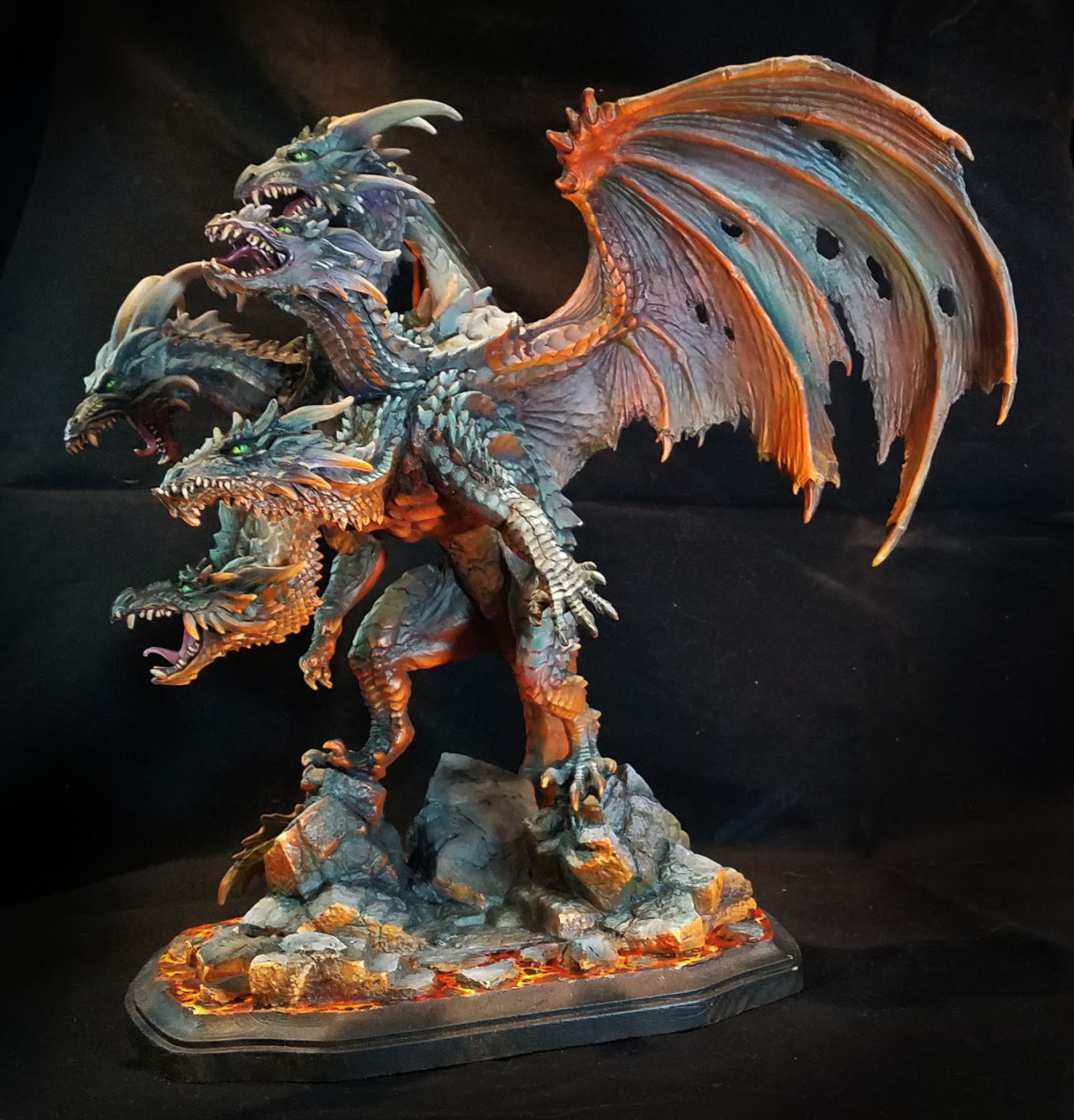
Time for some more images of the gargantuan 6 pound dragon!  As I mentioned in the first post, much of the initial layers were done with a Badger airbrush and Stynlrez primer.  Not only are there 12 colors of primer, you can expand these even more by adding some Ghost Tints.


I also wanted to mention the basing, which was a wooden plaque with some carved pink foam bits added to continue the original BONES base across the lava.


I added a bit of texture to the foam to match the original pieces, and once that was painted, you could not tell the difference!


The same Vallejo Fluorescent paints were used on the base, in combination with the Reaper Clear and Liner paints.  The yellow clear mixed with the orange fluorescent worked well for the lights, while darkening the orange with the Clear red and Red Liner paints made for some expanded value patterns in both the lava and the scales.


One thing to keep in mind about the fluorescent paints is that while they are pretty thick, they are very translucent.  This is what gives them the extra brightness.  There are absolutely no opaque properties to the paint.

So, you can almost apply this as a "glaze", even without thinning the paint at all!


I used this as an advantage as I was able to use my larger brushes and spread out the fluorescent paints very rapidly over rough surfaces.  While it was not a dry brush at all, the result was similar in a way.  However, I was not left with the usual scratchy/patchy brush marks that normally occur with true dry brushing.


I ended up deciding on a bright green for the eyes. This also had to do with the "color harmony" that I mentioned in the first post.  Most of the grayish mixes were created with Clear green and Clear Purple mixed with a lighter color, and having the eyes be a mix of Clear Green and Yellow meant that the lava and the grays were being tied together in a way...


The reason I like to make my own ray mixes is that I have far more flexibility in how  they are tinted.  Having a little more purple in the mix means that I can have some very nice grayed down tones that will appear more purple when you look at them more closely.

I love grays so much, I made it the subject of one of my five Painting Pyramid videos called "Shades of Gray" of course!


If I had more green in the mix, that became a very nice contrast to the deeper reds of the lava reflections.  This also meant that I could have a bigger range of grayish colors on the faces, giving them a little more depth than simple lights and darks.

Deep purple shadow colors against lighter greenish grays makes the faces come alive, as opposed to looking like a colorized photo which has light and dark, but no real color variance.


I hope that you have enjoyed my little discussion on colors here... that is as much fun as talking over the "Arc of History", and I will go on and on about it to anyone who will listen!

Stay tuned for much more!

Friday, September 14, 2018

Up In Flames


I just posted the first vehicle painting video in the Char Bis tank platoon box set from Warlord Games, which was so much fun to paint!!  Here's a link to the video:


As you can see, I did this video with my standard acrylics, with a few twists.  I took some of those acrylic paints and combined them with weathering powders and water effects to create some fresh mud!  I needed this to dry in a hurry, since I needed it for a battle report just a few hours later.


Having painted a few of the Char Bi Bis in the typical French camo schemes, it was a bit jarring to paint this in Dunklegrau.  However, it is also interesting to see things in a whole new light.  It definitely made a familiar shape look far less so.


As usual, my Secret Weapon weathering paints and Reaper Liner paints led the way.  Those make glazing so simple and easy, and they can be mixed or thinned with nearly any amount of water and still maintain their color integrity.


It did quite well in that game by the way, halting a massive Soviet advance in its tracks and saving the Germans from being overrun!


There will be two more videos in this series (such as Bilotte's Char Bi Bis), which will end up on the Patreon Page for the $5 level:


Wednesday, September 12, 2018

Arcane Basing: Patreon series


My new Patreon tutorial video Army Painter series all begin the same way... with basing!  Each series is usually 5 episodes, with the first one demonstrating how to go about basing multiple figures for units and armies.

I try to discuss the "costs" involved with basing an army, and not just the monetary variety!

There is another currency, and that is your time.  One of the main reasons I see folks shy away from more involved basing is that they don't want to spend that extra time to create the bases.  Purchasing them can be very expensive, and they are always very recognizable or repetitive.

It is been the one thing that my armies are known for, and to me it is one of the most enjoyable aspects of army building.  There is no better way to tell a story about your army than through your bases, so making that extra effort is critical.


Even I have had to develop ways of making these more elaborate bases in a timely fashion, and that is something that I demonstrate in each series.  I also try to keep the materials and tools as generic as possible, so that they can be used from project to project.

Most of what you see in this scene is used for nearly all of my bases.


Painting the bases is also part of the project, and I try to not only demonstrate how to do so, but to show how much additional time it might take for the painting choices that are made.  I am pretty sure that there are not many tutorials out there which take on this kind of theory.


I also dive into how to make your bases work withing the constraints of the game system, such as true LOS and base to base contact, etc.  Showing how the "footrprint" of the miniature influences your choices on size, designs, and even the painting of the figures themselves.


By doing these glowing runes, I had to spend additional time painting OSL on the figures.  This is another version of the "cost" in time.  Again, I try to take you through the entire process... not just painting a few happy figures!

I purposely try to show you the adjustments that are needed, and even changes in concept based on practical concerns about time or game play.


I am now on Series 3!  The second series took you through painting historical figures in oils, and winter basing.  Series three will tackle a unit of Lord of the Rings Easterling Kataphracts.  I will emphasize NMM and Freehand a great deal in this set.

This Medusae Series One set is available to those pledging $15 (see the pledge levels on the right of the patreon page).  It over 11 hours of video content, so I think there is a lot that you can glean from it!

Check that out here:


Tuesday, September 11, 2018

Scale and Fire: Part 1


At long last, some images of the completed Mega Dragon from the Reaper BONES line, sculpted by Julie Guthrie.  I tried to take the best images that I could while we were still at the convention.

I did a few demonstrations on this monster, starting at GenCon last year.  Here's a look at the original post where I airbrushed the Stynlrez primer:


Here's part two of that series, which gives you an insight into how I approach massive beasts such as this:


Once I had the lights and darks generally established, I could start to think about the basing, and the possibility of doing the lava reflections.  All of this work would be done with standard brushes.


Using the same Vallejo florescent paints that I normally use for lava, I mapped out where I wanted the most intense reflections.  I have a Facebook Live episode that might help demonstrate the fluorescent paints as well:


In order to make these colors stand out, I needed to have several types of contrast.  Not just darker colors to show the light, but much cooler tones as well as the muted, grayed down colors you see on the scales and wings.


I used primarily mixtures of green and purple, which can make a variety of gray when a lighter color is added.  Using these simple colors, I can have an infinite variety of muted tones that register to the eye as "gray", but with far more interesting subtle tints.

If I have more green in the mixture, I have a wonderful greenish gray, etc.  On a figure as large as this, it is very important to widen the variety of tones over the wings, scales, and so on.


If you use only the same colors of gray everywhere, people looking at it will get very bored very quickly!  For instance, the wings have grayish greens, blues, purples and even tans.


In fact, each wing has a slightly different set of colors.  When you approach the dragon, that all looks like 'gray', but looking closer will reveal all the very interesting color tricks that are taking place.


I repeated this on the scales, so that one head would be a tiny bit different than the other, but keeping to that same set of gray/purple mixes meant that I did not have to worry about "color unity".

While I could get a very wide range of colors, they were all created from the original batch of just 3, with a few glazes here and there of blue and brown liner paints.


It was great to do several live demos on this dragon at Fort Wappel during ReaperCon!

Next year, I will try to have a much larger monitor, and perhaps even a mic set up so that it is easier to hear me.  Also, I will try to create a schedule of events before the convention.

I go into this type of color theory on just about all the painting videos available on my patreon page, in both acrylics and oils.  You can check that out here:


Monday, September 10, 2018

Reapercon 2018: Painting the Beast


On Saturday morning of ReaperCon, I was handed a rather large piece that needed to be painted immediately for an upcoming CAV tournament. 


This was mostly 3D printed,  and it must have measured at least 15 to 16 inches long!!


I had the Badger airbrush Sotar hooked up, and Stynlrez primers on hand, so I had to dive in right away.

Using the gray primer,  I covered the printed areas and the resin sections as much as possible.  I moved to a black and brown mix in the shadow areas.


After setting up the darkest locations, I used the tan color to lighten the gray primer, and brought out some lighter areas.

Once that was completed,  I started to map out areas of weathering with the orange brown primer.


To deal with the striations in the large printed sections, I knew that I needed to have rust streaks in several places.


However,  it is very easy to go overboard with such things, especially when you're this rushed for time on something so massive!


Since this was such a massive beast of a vehicle, I thought it would be more visually interesting if it had some larger marking or color beyond gray.

Since grayish blue is not an uncommon secondary color, I used a combination of blue tac and Parafilm to mask off a section.

I have a post that goes into more detail on the Parafilm here:


I mixed some of the slate blue primer with a dark blue Ghost Tint, and worked in the shado areas.  Over this, I sprayed a lighter series of mixes to create highlights in this blueish area.


With time counting down to the event, I made a few small freehand designs which would look interesting from a distance but ones that could not be interfered with by the texture of the 3D printing.


I continued to play with some highlights here and there, trying to bring out a few edges.

Since I didn't have any weathering powders with me, everything was done with the Secret weapon weathering paints.


I chopped up one of the craft brushes to turn it into a chopping brush, applying some brown liner mixed with rust along the leading edge of the hull, wings and so on.


The extra color of the blue stripe helped to bring out the rust effects a little bit more, since there was additional contrast to the basic gray.

I also started to paint the tiny cockpit windows. 


All too suddenly it was time to take this away to the tournament room where it was used as terrain/display!


This might be the best way to see how big this was!!