Tuesday, September 27, 2016

Let's see what happens: PART TWO


Continuing the experimentation with the AMMO oil based products, I moved on to the vertical surfaces and some of the darker washes.  Since these layers were not going to be drying anywhere near as rapidly as my normal acrylic versions, it meant that I could continually blend one layer into the next.

Again, the usual approach to these materials is to cleanly layer one on top of the next after the original layer is dry.  I kept forging ahead to see what kind of blending could be done :-)


These new layers needed to be darker, so I used more of the wash products.  Unlike the Filters and Panel washes, these are the thickest and most heavily pigmented of the washes.  You will see that play out over the next few images.


Not only would these layers be darker... they would also be allowed to accumulate or be less blended to create staining.  This is visible on some of the horizontal panels.
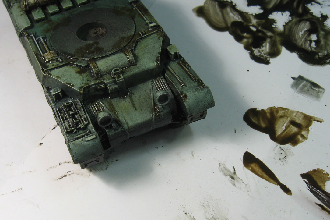

As for the sides of the hull, my flatter, dry brushes were used to swipe the wash colors downward, creating some nice weathering marks.


I did something similar on the sides of the turret. Again, it was a great advantage to be able to position some paint, and then have so much time to manipulate it!  I loved the option of wiping something away if I didn't like the result.

As I have mentioned before, this far longer drying time will make it much easier for me to paint multiple vehicles at once.  The acrylic approach is difficult enough with just one at a time.


At this stage, I have been able to work in the darker shades all across the vehicle, which will set up the subsequent, dedicated weathering effects.


I have some of the rust and grime colors, so those were the first paints that I tested.  Having done rust effects with endless combinations of acrylic paints (and even weathering powders), I liked the options the oil based products presented.

The increased capillary action of the oil based pigments proved very useful in getting rust colors deep into recesses, which is exactly where they would accumulate.  In the past, I would use a mixture of powders and sealer fluid to get this action.  Now it's all in one handy jar!


The rust is placed on other surfaces.  You can see a few rust streaks emerging from paint chips in some areas.  The streaks are also easier to randomize, since I can go back in and rework the shape and length of each streak.

The more rapid drying paints force me to get the streaks exactly the right shape with far less ability to manipulate later.


This is repeated across the vertical surfaces too.  Note that I am starting out with the darker rust tone.  Later I will work in a bit of the lighter rust color.


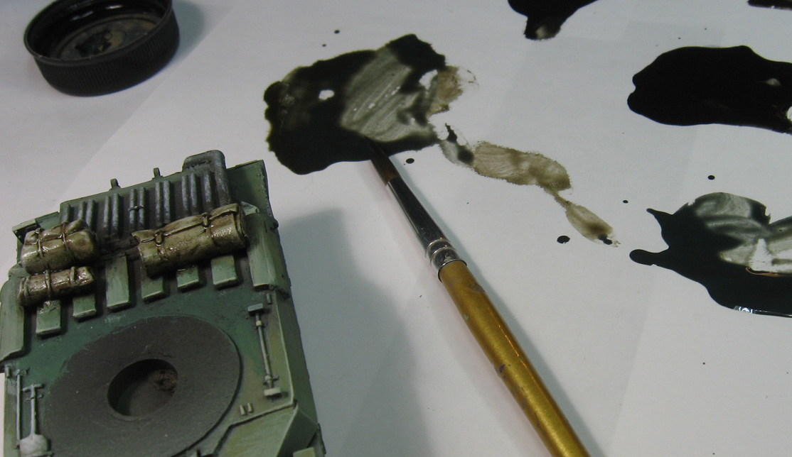
This overview shows you how I have been mixing multiple colors and paint types on the palette.  Just like my regular acrylics, I like to mix the colors that I need.  A big advantage in this approach is color unity, as only a few basic colors are used to create a wider range of shades and tones.

Everything becomes more cohesive as a result.


If you look at the palette off to the right, you can clearly see that the streaking rust has been mixed with the panel washes.  This created a whole new shade of color, which was used on the darker areas of the stowage.


Some rust was added to the top of the turret and the extra tank treads as well.


Here's where things REALLY get interesting!  I wanted to see if I could get some semi opaque lighter colors to work with, just like I do with my acrylics.  This is normally done by mixing my glaze materials with 'regular' paint.

I will have to take a few very different materials and combine them to get that light middle tone.  I'm taking the very opaque mud effects pigment and mixing that in with panel line washes, etc.  You can see that I can create muted green colors, light tans, and even flesh tones!


I also wanted to try out some lighter rain streaks on the darker sides of the hull.  The first step was to place a few dots of that light mud pigment mixed with a touch of panel wash to make it flow.


Using one of my flat dry brushes, this was pulled and stretched downwards to make the streaks.

The third episode will show some more of the new paints being mixed and applied for the first time, including the grease and engine oil colors.  Some dry pigments will also be added, and I will try to mix static grass and even leaves into the heavy mud pigments!

Stay tuned...


Monday, September 26, 2016

Let's see what happens: Part ONE


While I have done some testing on the AMMO mud products (heavy mud, spatter, etc.) on both vehicles and infantry figures, I have not done an all out experimentation session with all of the oil based painting products.

These encompass three key materials.  Filters, standard washes and panel line washes.  I had a decent selection of each of these to try out.  As you know, I used to do watercolor, pastel and even oil painting.  I would have to call upon some long ago experience and memories when it came to oils!

I had a number of vehicles which had been worked right up to the point where these new products would be tested... essentially the shaded basecoat for vehicles!

You can see that the Opel Blitz, Bren carrier and truck have been the original test subjects.  I was not trying to get any kind of specific result or look, it was all about pressing buttons to see what might happen!

I learned a lot about the filters and the panel line washes.  One vehicle was left in the original Shaded Basecoat, and that was the Matilda II.


Have played a number of how to videos, and reading articles in the excellent Ammo Weathering Magazine publications, I could see that the products I have discussed tend to be used separately, and in a specific order. 


Normally, the filters are applied first, with some panel line washes and then the 'regular' washes.
This standard approach is a little more 'mechanical' than what I will be doing.  I do have a typical set of brushes though... and they will be used to apply the paints and then remove them.

As these posts move forward, you will see how the broader, flatter brushes to the right will be utilized to wipe away excess wash liquid and even blend washes long after the original applications.


I had a few different 'colors' set out on the palette.  As I normally do, I have a blue, a red and a yellow.  In this case, the blue was a dark blue/grey panel wash, and then other washes that were brownish yellow, and so on.

Mixing these two materials together would create that dark green which I wanted to shade the vehicle darker.


Usually, the panel washes are meant to be 'touched' to the surface, and allow the capillary action to let the paint to spread through crevices on the vehicle.  However, I added some of the regular washes, which would give this a little more body, and less of the capillary effect.

Still, unlike water based products, these washes will sink deep down into recessed areas.  In addition, water marks are a thing of the past!  I don't have to fret over the precise spacing of the pigments here, because I will be going back over this and removing as much or as little of the wash as I want!


This is a huge advantage.  In this picture, you can see that I have applied some brown/tan mix to the stowage items.  This wash will stay wet for quite a while, giving me that opportunity to go back in an wipe away the excess.

I also do this with my water based glazes, but this must be done immediately, and I have to be more careful to avoid those water marks.


A much deeper, darker wash is mixed for the rest of the hull.  I am mixing some of the yellowish wash with the sea blue panel wash to create a green.  There are a large number of colors to choose from in the AMMO line, but I have to use what's on hand.


I applied this wash color to several horizontal surfaces, but not all of them... just a few selected panels.


I took one of the broader, flatter brushes and began to wipe away some of that wash to reveal the lighter colors underneath.  A 'scumbling' movement was used, which essentially scrubbed the wash away.

Again, since this is an oil based product, this kind of removal of pigment won't create water marks.


I continued this process of washing and removing on various panels.  It's important to leave yourself an area to hang onto, because it will take a while for areas to dry.


I mixed an even larger variety of panel washes with the standard washes to make sure I had a variety colors.  The filters are commonly used to tint the colors, but they are applied in a different way.  These must be placed more evenly on the vehicle, and not allowed to collect or pool in recess areas.  They are designed to gently 'nudge' a light color to a different hue.

I used these to thin down some of my heavy glazes, as a filter is a paint with more of the thinner mixed in.  I forget what the exact percentage is, but it is nearly 70% thinner on the filters.


Take a look at the back panel in this picture, with the dark wash applied. The next image will illustrate what that looks like once I have manipulated it with the dry brush.


Here it is after manipulation. I can also use regular flat brushes for this, or even Q-tips.  For these first tests, I wanted to have as much control over the experiment as possible.  I will definitely begin using the larger flat brushes for the process in the future.


The washing and removing process continues on the turret, but as you can see, there are a lot of surfaces here.  Most of the original glazes were variations of panel line washes, since this is exactly the kind of area they were intended for.

I have also been using the colors that I painted on the vehicle with regular acrylic paints as my base.  All I am doing here is creating more shading, and altering the tints of certain areas.

If I use the blue/black panel wash or the green for camo wash, I will get different tints, but that capillary motion will be consistent through all of them.  As I continued the experiment, I began to realize how powerful this motion would be!


In Part Two, you will see how the sides of the hull were rendered, and the mixing of even more materials together for attaining the desired effects.

This is all very new, so each post it going to show lots of changes, additions, etc., to these techniques.  It will be a very fun journey of discovery, which always helps to keep things fresh and new!  Working with a product that does not fully dry for hours will allow me to work on far more things at once.

Eventually I will be doing this kind of technique on 'regular' infantry style figures, so stay tuned!!


Sunday, September 25, 2016

The Big Bad Bugs!


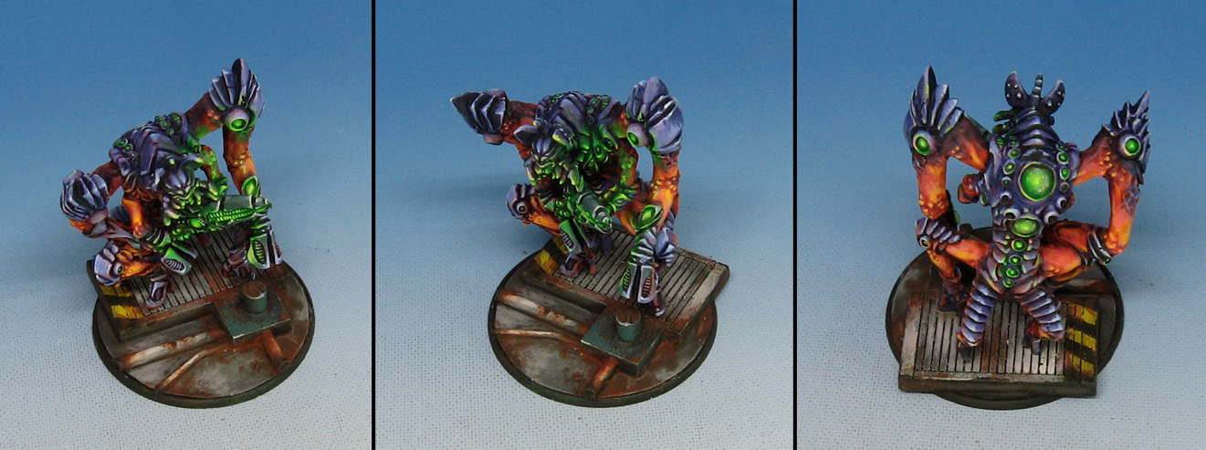
This time we go back to the future of Antares, with the first member of a Tsan Ra Phase squad.  As with the other Isorian figures, this was a chance to get back to the brighter color schemes and the object source lighting.


It was a little challenging to squeeze the brush into certain areas to continue the color transitions and work the OSL, given how many things are protruding in one direction or another.  Having the bright oranges available as a contrast to these highly saturated greens was definitely an advantage, which is one of the reasons I tried to select this particular scheme.


Just like the other figures from this army, the plain gray concrete/deck plating made a nice resting place for the eyes with all the bright colors!


It's gonna be interesting to see the entire squad of three together.  These guys are on 40mm bases, by the way.

Stay tuned!


Saturday, September 24, 2016

A clear future


Here's another practice figure for the painting with Reaper clear paints at Reapercon just a matter of weeks from now.


The concept here is to begin with a very muted value 'sketch', just to lay out where the general light and dark patterns should be. 


Using the clear blue, green and purple clear paints,  a series of glazes provides the actual colors that you see here.  The clear paints are very saturated,  so even when thinned with water, they maintain their structure and consistency. 


Once the generic color values have been achieved,  I can start mixing in lighter opaque colors with the clears and get more gradations. 


Friday, September 23, 2016

Blades of Glory


Here's another figure that I used in the dealers room demos at GenCon to illustrate the use of glazes to not just shade, but tint as well.

Now that I am painting so many vehicles, it is interesting to hear the terms modulation and filters being substituted for my more traditional artist names for those techniques.  It was a bit confusing at first... especially figuring out what was meant by a filter.


For me, tinting is a crucial stage, because that is what allows the Shaded Basecoat to be so effective.  The principal behind that is to get lights and darks positioned across the entire figure as rapidly as possible, just like my old 2D painting days!

Once that has been completed, the 'real' colors come out in the glazing stage, where I not only darken colors, but tint them to the hue that I need.  For instance, the coat on this figure was originally going to be blue or brown... but early on the need for something brighter and more eye catching became apparent.


I tried out a few glazes of reaper Clear Red, just to see how that might look.  Yes, this is the prime advantage of the Shaded Basecoat (which I say over and over again... sorry!).  I can completely change my color scheme in mid stream if the need arises, since I have only done a basic framework of lights and darks.


The final colors are confirmed as the glazing and tinting covers over the Shaded basecoat.  I use plenty of different glazes, washes, etc. , that all cover that early shading very effectively.  One of my classes at Reapercon will focus on this element of tinting, using those clear paints.


Thursday, September 22, 2016

The lady in Red


One more female character for you from Red Box Games.  She is yet another figure from the giant batch of winter theme characters which spans a number of miniatures companies.


Whenever possible, I tried to reflect a variety of sky blue colors to swords, armor and shields.  This blue was more saturated than what was used on the 'ground', or snow facings.


All this contrasted well with the deep reds of the tunic and shield.  Here and there the tiniest bit of rust was applied.