Tuesday, September 13, 2016

Keeping the line moving


The Samurai surge keeps building with another lineman.  Just like the first one, he is without the head crest, which I have saved for the Blitzers and Black Orcs.


When I first attempted sculpting this team, the armor pieces were done in sections, one by one.  Needless to say, that took a long time, because each arm has between 3-5 sections!  This time around, I was able to do them all in one sheet.  

The sculpting tools were the same, but experience had shown me some tricks to get a similar enough result with the one shot approach.


Still, I only did one arm at a time, or just the leg sections at once.  This was to avoid the risk of sticking my finger into freshly sculpted green stuff.  And yes, this will happen.  Fresh green stuff sitting around has a 100% chance of getting smushed, no matter how careful you are.

By working on many figures at once, you can rotate through all the pieces you are working on, and still make a lot of progress in each section.  In this case, I was adjusting nearly 20 figures at the same time.


Monday, September 12, 2016

A Sniper on the Loose


Next up on the Isorian unit list is the Phase Sniper.  As usual, there's a small drone included in the unit.  I'm continuing the same basing and color scheme throughout the entire force, with some variations here and there as need be.


When carrying a color scheme across an entire army, as I have done any times, the real trick is to create a scheme which can not only be repeated over and over again... but one that can also be applied to vehicles and heavy weapons.


Creating something that looks cohesive on both standard infantry and 'irregular' objects such as these weapon platforms takes experience and careful planning.


This is why the color test figures are done along with the bigger, more specialized pieces.  However, the color test piece is carried all the way through to completion, while those other units wait until that pattern is more ingrained in my head.


Any time you have a carapice such as this, the temptation is always to do various spot patterns.  Since I wasn't sure if I wanted to imply more of a manufactured look to that section of the figures, I kept it a more solid color.


One reason I did these rusty deck plating style bases was to give some easy contrast to the far warmer and more saturated colors of the figures themselves.


I have taken a few initial group shots of the figures which are already complete.  They showed me that the color scheme will indeed work out across the entire army... so stay tuned for more!


Sunday, September 11, 2016

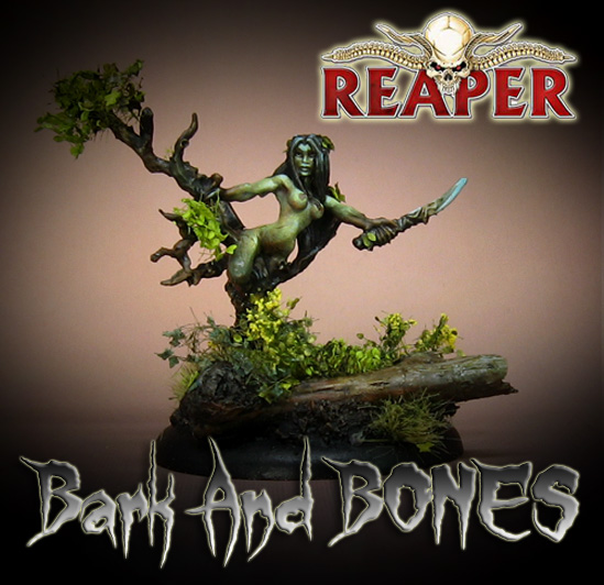
Bark and BONES


This BONES Dryad figure was a good opportunity to test out a few different things.  Primarily, I wanted to see what would happen if I did some glazes over the leaf foliage.  There were a few situations recently where I did so on plastic foliage, and I really liked the results.


While there are a number of different foliage colors available, I've noticed that they tend to be very monochromatic within that 'spring', 'summer' or 'fall' designation.  In this experiment, I worked with the spring version.

Those trend towards very bright greens, which I would attempt to tone down with some darker glazes of greenish browns and warm greens.


I had to be cautious as I applied these glazes, because getting the leaves too wet might cause them to curl or be too dark... or even clump together!

To add to the experiment, I had glued some individual leaves in the hair, which mimicked what was sculpted into the hair.


That aspect of the experiment was particularly successful, which made me happy!  I think that it also worked the way I wanted on the ground foliage as well.  Next time I will see what happens if I use the AMMO filters and glazes.

The oil paint might not soak into the leaves quite as much, and might reduce the risk of clumping and curling due to the lack of water.  The oil washes might also sink even deeper than the thicker water based washes could reach.

Stay tuned!!


Saturday, September 10, 2016

Skink Power!


The Great Crested Skink strikes again!  Fearsome and mighty, he fears no human.


While the Skink sprues are not terribly complex, they allow you to make so many different varieties and poses... not to mention the ability to make the blowpipe for weapon/shield types.


Just as with previous bases, a little touch of aquatic foliage was added.  While the paper foliage I have been using recently is more realistic, this was better for figures that were going to be in a large unit during games.

The foliage is flexible, and that meant it would be able to withstand a lot of rough handling!


The basic colors of this skink unit revolved around greens, there was a wide variety of green shade employed.  I made sure that warmer and cooler greens would be used on one figure or another, while some hat stripe accents or spots.


Friday, September 9, 2016

The Wings of Angels


It looks like I still had a few of these good old Archangel figures that were first published by I-Kore (now by Urban Mammoth).  Most of these were used in my Sisters of Battle contingent from my Adepticon tournament army.


I had a lot of fun with this color scheme as well, positioning the brassy colors with the higher saturation greens.  Most of the bases were made using pieces of the Secret Weapon broken columns.


Thursday, September 8, 2016

Chaos Rides Again!


Mierce Miniatures has some very dramatic riders and mounts among the various factions, and this is one of my favorite.  As some of you familiar with the large "snow base project" have seen, figures from a number of different companies are being used to create one large setting.


The snow landscape really does work well with this figure, and even the matched colors from previous miniatures from Privateer Press and Red Box work well on this guy.


The figure was also very hefty and substantial, which made it seem more like the heavy chaos knight.


A variety of slate gray, light greens, light flesh tones, etc. were used to create the armor colors.  Even a bit of muted purple was used.  In fact, purple mixed with green can make very interesting grays!


This view shows the upper surfaces on the horse's armor plates.  The idea was to have these tones be warmer, with the plates facing the snow be even more muted, and cooler in tone.  I wanted to show a bit of the snow reflecting on them, or at least influencing the color in some way.


Finally, the reddish brown of the horse's fur was the one place I could make a deep, warm, dark shade that would serve as a contrast to all the the blueish gray colors.  It would also tie in to the gold/brass armor plates, making them a part of the whole and not stand out all by themselves.


Wednesday, September 7, 2016

Prepare to Fire!!


Time for a little ground fire support for the Isorians from Warlord Games in the form of a Senatex team with an X-Launcher.

Just as it was with the color test figure, this color scheme has been a very nice switch from all the muted and earth tones of the Steampunk, Western and now World War 2 miniatures.

I get to use bright greens and reds side by side, accented by oranges and yellows.  These are also the first sci-fi bases I've done in quite a while too.


I didn't think I would like painting all the drones (every squad and weapon team has one), but they have actually been kind of fun.


In general, there are more 'organic' shapes on these figures than I have painted in a very long time.  The clothes, weapons and other items have been more manufactured... or even 'real' on many recent figures.


Having assembled and painted a number of the Bolt Action weapon teams, it is very neat to have these guys side by side with those 20th century counterparts!


I have other weapons systems under way, along with standard squads and command figures.


Stay tuned, because much more is on the way!