Sunday, July 12, 2015

This won't give you gas


Here are some fun images of the finished shipping container.


Each stage of this project was very fun... coming up with the logo, doing the weathering, researching the lettering, and so on.


I certainly learned a lot more about shipping containers than I ever thought I would!


I didn't intend originally to use printed signs on the container, but it was a very useful experiment.


I never would have thought of the various signs of the contents, such as the flammable signs!


The other containers are shapes that may not allow as much in the way of printouts, so that will be yet another experiment!


And, of course, they do open and close, which will be very fun for in game tactics.


Overall, I felt like I was able to get very close to those original reference images.


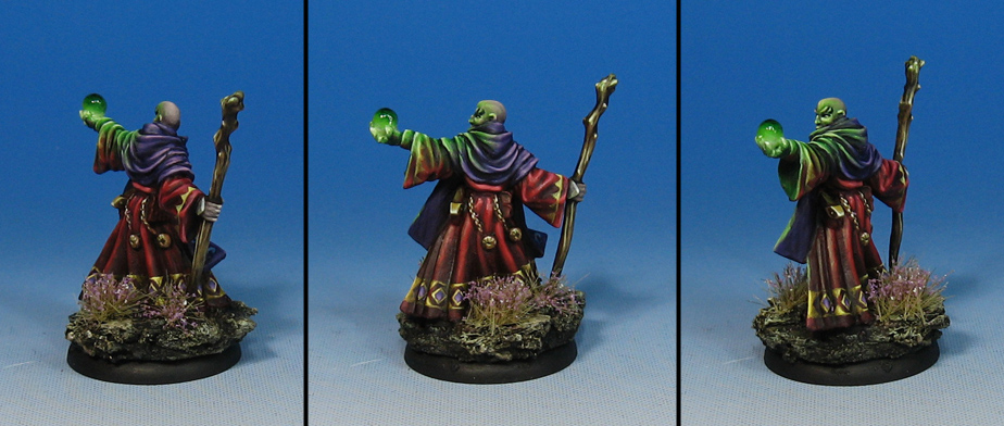
Here are some miniatures to give you a sense of the scale.


The Highland Moss guard seem to claim it as their own. :-)


Saturday, July 11, 2015

HALT!


The Law takes many forms in Wappelville.  It can even be administered by the Iron Men of law enforcement, the UR-30 Lawbots.


They patrol the streets of Wappelville 24 hours a day, never tiring, and never showing mercy.


Strict adherence to the law is mandatory, and summary executions are the programmed response.

Better think twice about jaywalking next time.


Getting familiar with your kitties


Here's a fun double set from Dark Sword Miniatures!


It was a real blast to paint some Siamese cats for the first time.  I had done a 2D painting with a Siamese years ago, but this was entirely different.


Of course, the lady was fun as well!


I tried to have complimentary colors between the two sets of figures, with not too much contrast.


Making them cohesive but different was a challenge, but worth it!

They are also here:


Friday, July 10, 2015

Kabuki intro


I hadn't had a chance to paint one of the Kabuki Miniatures until this Leona Lobo figure happened.


I thought that I would try out the Realistic Water on the background piece, just to see what it might look like.


It was a fun textural difference, and seemed to give it more of an alien look.


She's also here:


The Blue Mage


Yes indeed!  Another Reaper classic.  I have had these around for many years, and it is very fun to finish them off at last.

Interestingly enough, my color palette has changed in a huge way over the intervening years.  It used to be much more like this, with lots of blues and reds.


Because of much of the subject matter I have painted in the last 3 years in particular, greens, browns, and other more muted earth tones have been the focus.


I suppose that painting all the WWX figures are the prime reason, but many of the other companies have been pushing towards those earth tones as well.


It is nice to get back to the old palette once in a while!

She's also here:


Thursday, July 9, 2015

Let me look into my crystal ball...


Here's another fin Reaper miniature which has been around for a very long time.


It's been fun to use the fluorescent paints and the realistic water on these glowing spheres!


He's also here:


Burn in Designs... fully contained.


It's time to see the final phases of rendering the Burn in Designs shipping container!

We begin with manipulating that logo graphic...


The real key to making it looks like a container was to get some reference material on those extra markings.  A google search revealed all kinds of info on that topic!


I sized some additional logos, and even found some material signs for the rig... flammable, hazardous, and so on.


To make maximum use of the paper, I put in some street signs, magazines and newspapers for Zombicide bases.


The printout.


Each graphic was cut out and fixed in place...


This view shows the specific stats on what's inside the container.  I went with a generic Impact/Helvetica font.


I placed some of the materials signs around the rig.


I put some of the secondary signs on various areas on top of the container and the sides...


Once that was all glued in place, I could do some weathering and general blending.


This would be the toughest to match, as there was already a great deal of weathering on the door.  I didn't want to lose too much of the lettering.

A lot of this had to be done with a very dry brush, or I would run the risk of warping the paper or smearing the ink.


More weathering on the other panels helps to make it look like it was part of the original painting process.


Now for some views on the rig itself.


As always, I learned a lot making this project.  There are a few other containers yet to paint!