Sunday, October 2, 2016

The Ranger


I seem to remember painting this Ranger figure for our role playing group many years ago, so it was interesting to work on that same figure again with the knowledge that I have now.  This had been prepped for Marcon, as it is a Sandra Garrity miniature.


There was probably not much freehand on the first version, because it was more difficult at that time to tone down the design in recesses.  I have a few ways to do that now.  

In this case, I used a Vallejo transparent brown paint to create not only some shadows, but to alter the color as well.  This pushed it towards warm, as opposed to the usual cooler dark blues which I have used in many instances to shade such areas darker.


The base is yet another Green Stuff World sculpey base.  There are many more designs yet to be featured on the blog!


The ground level view gives you a better look at the underside details. It was a lot of fun to balance all the warmer reddish browns with the yellowish greens.  To get a little bit of contrast to all that, the color of the base is more of a cooler flesh tone pink.


Saturday, October 1, 2016

Blood and Brides


Here's another fun conversion for the Adepticon Dark Eldar army from a few years back.  I wanted to make a unit of Hexatrix Blood Brides, but I thought they should be much different from the usual Wyche figures.


Fortunately, I had some old Warhammer Fantasy Dark Elf figures around, and all it took was swapping one of the knife hands with a plastic gun hand to do the trick!


She's also here:


Friday, September 30, 2016

Pass Rush


We return to the Blood Bowl pitch with another member of the Samurai Orc team.  This time, a Blitzer!


The new method of sculpting the armor was even more helpful on figures with this kind of positioning of their arms.  When I first converted figures for another version of this team, I did the sections of armor one bit at a time, and that led to some odd angles.  Instead, I was able to make one long strip and work my way across all in one shot.


That created a much more consistent texture, which was ultimately a lot easier to paint than the first team!


Thursday, September 29, 2016

Lucky Charms


This 54mm figure was part of a demo at GenCon, showing how to maximize various shades and tones of brown, making them more of less saturated, or more green, yellow, etc.


This is illustrated here, as you see the differences in the hair color and the skirt.  One is more muted and reddish, the other is more saturated and warmer.  The top is more of a greenish brown by comparison.


I tried to incorporate greenish tones wherever possible, even on the skin tones.


These shots show the scale of the figure, and demonstrate how the grayish tones of those bases are designed to set off the figure... despite the relatively muted colors of the figure.  Still, I wanted to add the rust colors in order to bring down the oranges that you see in the hair.


One last look at Lucky!


Wednesday, September 28, 2016

Turning over a new leaf


So, we enter the final phase of pressing buttons to see what happens!  In the last article, you saw me mixing some unusual combinations of paints, such as the panel washes and other similar materials with the mud effects to create lighter, more opaque midtones.

This image gives you a nice look at the range of colors that I could create.  These were mostly used on the stowage.


They were also used on a few other areas to create some added interest, but mostly to see how well they would mix together for future projects.  A wide range of materials were mixed together as this image shows.


I was really looking forward to trying out the grease and engine oil products.  There's only a few places where you should really use those on any vehicle, but they certainly make the effects convincing!


The consistency and appearance of the engine oil is just that, and when you a very 'dry' base under it, the effect is even more dramatic.  Having the mud/wash opaque mix under the oil on the rear panel accentuated the oil effect in both color value and texture.

Now I had a semi-glossy material on top of something that was almost powdery/dusty in appearance... very cool!


One more view from above to show you how that looked.


The light rust wash is a fantastic color, and just a few touches of it here and there can really pop, especially next to all the muted greens.


There are only so many experiments that I can cram onto one tank, so I definitely wanted to try out the dry pigments!  There's a wide array of colors to choose from.


I picked a few different shades, and set them up in a container lid so I would not get them all over the place.


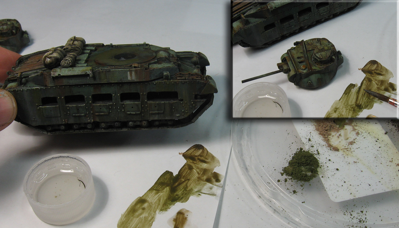
I put some Pigment Fixer in a lid, and used that to mix in with the powders.  As you can see, the dry powder instantly becomes a paint!  I have done this a lot in the past, even using this technique to paint entire figures.


You can also mix the colors together.

The advantage of working this way is that your 'dry' pigments will be fixed to the surface, with no need to spray them later, etc.


I painted a few greenish streaks on some sections of the hull with this mix, toning down a few of the rust streaks from previous layers.


Now it's time to have fun with the powdery effect!  I used a mix of the light and dark dust on the upper surface of the hull, making it collect in recess areas, as dirt would do.  I also gathered up splotches of  dust and dirt in the tracks and on the vertical sides of the hull (see insert).


OK... we have got a nice dusty look on the sides of the tank!  This illustrates why you have to layer the effects.  It would be very difficult to do the rust and grime streaks on top of this dust without spoiling the effect, which is why that's done first.


Finally, I wanted to add a touch of 'wetter', thicker mud on top of the dust.  Since there will be even less of this material than the dust/dirt, it is saved for the final layer.


I mixed the various types of mud together, as I usually do.  In general, the lighter color mud is supposed to represent dried mud, while the darker mud is 'fresh'.  This means placing the lighter colors first, and the darker, wetter mud on top.


One last experiment!  I wanted to see what would happen if I mixed static grass and other material with these heavy mud products.  I had a few places in mind for this effect, and it worked out even better than I could have hoped!


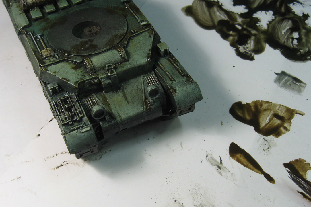
With the success of the grass/mud mix, I could not resist trying out some parsley flakes!  I wanted to use a thinner mud for this effect... using it to provide more color to the leaves besides green, and to help it adhere to the surface.


I wanted to scatter some leaves on the upper parts of the hull and sections of the tracks.  I even used some of the pigment fixer to aid in this process.  It thinned down the material, making it easier to apply.  Hopefully it will keep it stuck to the surface as well!!


I'm trying to get the leaves to "pile up" on near vertical surfaces, such as the area behind the headlights.


Now to let it all dry... and see what happens.  Stay tuned!!!


Tuesday, September 27, 2016

Let's see what happens: PART TWO


Continuing the experimentation with the AMMO oil based products, I moved on to the vertical surfaces and some of the darker washes.  Since these layers were not going to be drying anywhere near as rapidly as my normal acrylic versions, it meant that I could continually blend one layer into the next.

Again, the usual approach to these materials is to cleanly layer one on top of the next after the original layer is dry.  I kept forging ahead to see what kind of blending could be done :-)


These new layers needed to be darker, so I used more of the wash products.  Unlike the Filters and Panel washes, these are the thickest and most heavily pigmented of the washes.  You will see that play out over the next few images.


Not only would these layers be darker... they would also be allowed to accumulate or be less blended to create staining.  This is visible on some of the horizontal panels.


As for the sides of the hull, my flatter, dry brushes were used to swipe the wash colors downward, creating some nice weathering marks.


I did something similar on the sides of the turret. Again, it was a great advantage to be able to position some paint, and then have so much time to manipulate it!  I loved the option of wiping something away if I didn't like the result.

As I have mentioned before, this far longer drying time will make it much easier for me to paint multiple vehicles at once.  The acrylic approach is difficult enough with just one at a time.


At this stage, I have been able to work in the darker shades all across the vehicle, which will set up the subsequent, dedicated weathering effects.


I have some of the rust and grime colors, so those were the first paints that I tested.  Having done rust effects with endless combinations of acrylic paints (and even weathering powders), I liked the options the oil based products presented.

The increased capillary action of the oil based pigments proved very useful in getting rust colors deep into recesses, which is exactly where they would accumulate.  In the past, I would use a mixture of powders and sealer fluid to get this action.  Now it's all in one handy jar!


The rust is placed on other surfaces.  You can see a few rust streaks emerging from paint chips in some areas.  The streaks are also easier to randomize, since I can go back in and rework the shape and length of each streak.

The more rapid drying paints force me to get the streaks exactly the right shape with far less ability to manipulate later.


This is repeated across the vertical surfaces too.  Note that I am starting out with the darker rust tone.  Later I will work in a bit of the lighter rust color.


This overview shows you how I have been mixing multiple colors and paint types on the palette.  Just like my regular acrylics, I like to mix the colors that I need.  A big advantage in this approach is color unity, as only a few basic colors are used to create a wider range of shades and tones.

Everything becomes more cohesive as a result.


If you look at the palette off to the right, you can clearly see that the streaking rust has been mixed with the panel washes.  This created a whole new shade of color, which was used on the darker areas of the stowage.


Some rust was added to the top of the turret and the extra tank treads as well.


Here's where things REALLY get interesting!  I wanted to see if I could get some semi opaque lighter colors to work with, just like I do with my acrylics.  This is normally done by mixing my glaze materials with 'regular' paint.

I will have to take a few very different materials and combine them to get that light middle tone.  I'm taking the very opaque mud effects pigment and mixing that in with panel line washes, etc.  You can see that I can create muted green colors, light tans, and even flesh tones!


I also wanted to try out some lighter rain streaks on the darker sides of the hull.  The first step was to place a few dots of that light mud pigment mixed with a touch of panel wash to make it flow.


Using one of my flat dry brushes, this was pulled and stretched downwards to make the streaks.

The third episode will show some more of the new paints being mixed and applied for the first time, including the grease and engine oil colors.  Some dry pigments will also be added, and I will try to mix static grass and even leaves into the heavy mud pigments!

Stay tuned...