Showing posts with label Bones. Show all posts

Monday, April 8, 2019

Ancient BONES


The latest YouTube Live session had something very interesting... a combination of a Reaper BONES mini and some Green Stuff World texture rollers!


This was a test piece that I did for a more formal tutorial that will be created for the patrons on my patreon page.  I wanted to show a quick way to snazz up those BONES minis and get some nice results!  It will be part of a new pledge level regarding Reaper miniatures (a link to the page): www.patreon.com/JamesWappel


While my voice recovers from Adepticon, I will be doing a few of these live sessions.  In this episode, I talked about how the base was created, and I take you through the process of painting it.  Then I work on the figure itself, demonstrating some NMM, freehand, and the usual Shaded Basecoat & Glazing.


Here's a link to the live session!! https://youtu.be/uNH48XRMoak


Sunday, September 16, 2018

Scale and Fire: Part 2


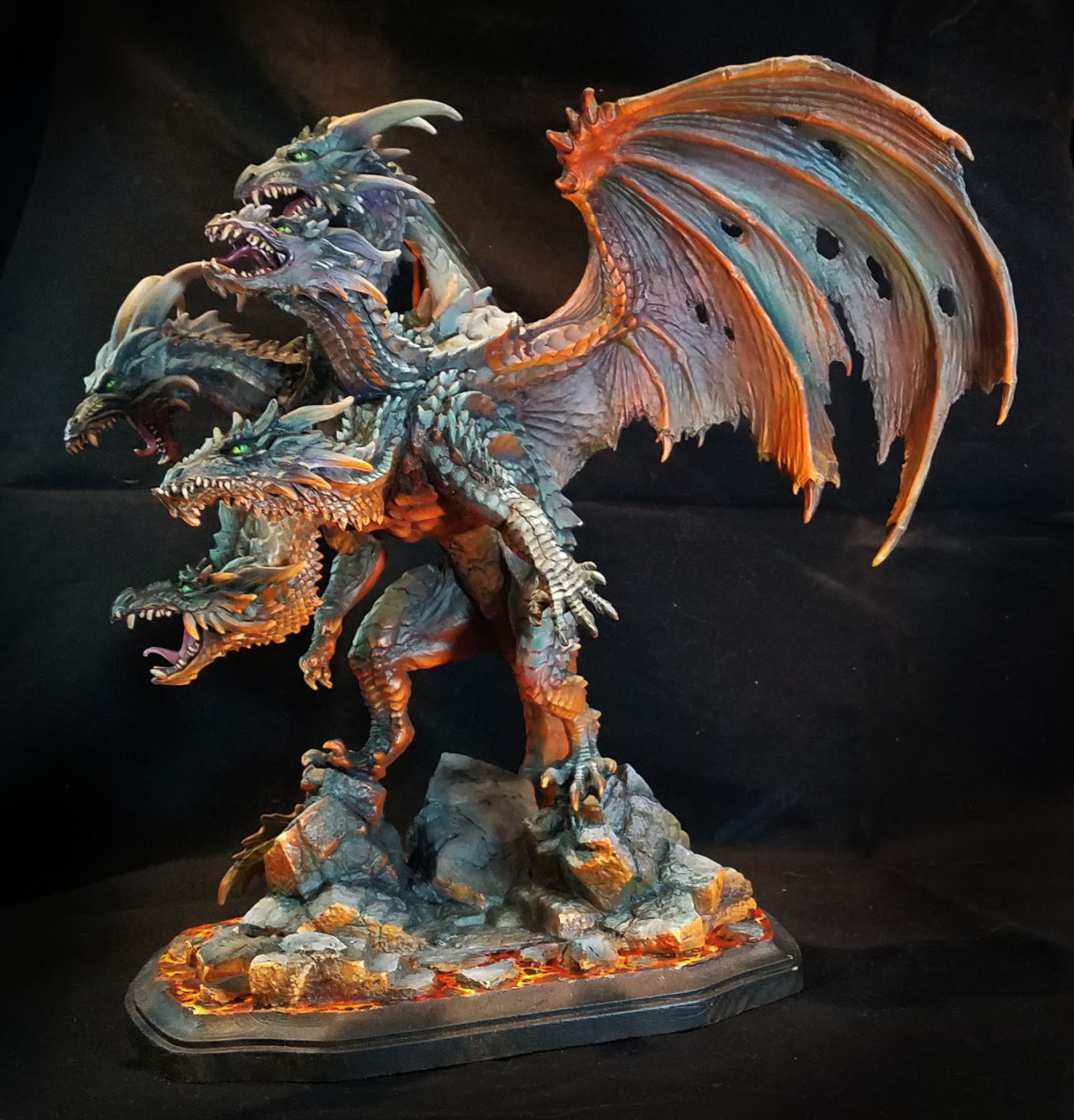
Time for some more images of the gargantuan 6 pound dragon!  As I mentioned in the first post, much of the initial layers were done with a Badger airbrush and Stynlrez primer.  Not only are there 12 colors of primer, you can expand these even more by adding some Ghost Tints.


I also wanted to mention the basing, which was a wooden plaque with some carved pink foam bits added to continue the original BONES base across the lava.


I added a bit of texture to the foam to match the original pieces, and once that was painted, you could not tell the difference!


The same Vallejo Fluorescent paints were used on the base, in combination with the Reaper Clear and Liner paints.  The yellow clear mixed with the orange fluorescent worked well for the lights, while darkening the orange with the Clear red and Red Liner paints made for some expanded value patterns in both the lava and the scales.


One thing to keep in mind about the fluorescent paints is that while they are pretty thick, they are very translucent.  This is what gives them the extra brightness.  There are absolutely no opaque properties to the paint.

So, you can almost apply this as a "glaze", even without thinning the paint at all!


I used this as an advantage as I was able to use my larger brushes and spread out the fluorescent paints very rapidly over rough surfaces.  While it was not a dry brush at all, the result was similar in a way.  However, I was not left with the usual scratchy/patchy brush marks that normally occur with true dry brushing.


I ended up deciding on a bright green for the eyes. This also had to do with the "color harmony" that I mentioned in the first post.  Most of the grayish mixes were created with Clear green and Clear Purple mixed with a lighter color, and having the eyes be a mix of Clear Green and Yellow meant that the lava and the grays were being tied together in a way...


The reason I like to make my own ray mixes is that I have far more flexibility in how  they are tinted.  Having a little more purple in the mix means that I can have some very nice grayed down tones that will appear more purple when you look at them more closely.

I love grays so much, I made it the subject of one of my five Painting Pyramid videos called "Shades of Gray" of course!


If I had more green in the mix, that became a very nice contrast to the deeper reds of the lava reflections.  This also meant that I could have a bigger range of grayish colors on the faces, giving them a little more depth than simple lights and darks.

Deep purple shadow colors against lighter greenish grays makes the faces come alive, as opposed to looking like a colorized photo which has light and dark, but no real color variance.


I hope that you have enjoyed my little discussion on colors here... that is as much fun as talking over the "Arc of History", and I will go on and on about it to anyone who will listen!

Stay tuned for much more!


Tuesday, September 11, 2018

Scale and Fire: Part 1


At long last, some images of the completed Mega Dragon from the Reaper BONES line, sculpted by Julie Guthrie.  I tried to take the best images that I could while we were still at the convention.

I did a few demonstrations on this monster, starting at GenCon last year.  Here's a look at the original post where I airbrushed the Stynlrez primer:


Here's part two of that series, which gives you an insight into how I approach massive beasts such as this:


Once I had the lights and darks generally established, I could start to think about the basing, and the possibility of doing the lava reflections.  All of this work would be done with standard brushes.


Using the same Vallejo florescent paints that I normally use for lava, I mapped out where I wanted the most intense reflections.  I have a Facebook Live episode that might help demonstrate the fluorescent paints as well:


In order to make these colors stand out, I needed to have several types of contrast.  Not just darker colors to show the light, but much cooler tones as well as the muted, grayed down colors you see on the scales and wings.


I used primarily mixtures of green and purple, which can make a variety of gray when a lighter color is added.  Using these simple colors, I can have an infinite variety of muted tones that register to the eye as "gray", but with far more interesting subtle tints.

If I have more green in the mixture, I have a wonderful greenish gray, etc.  On a figure as large as this, it is very important to widen the variety of tones over the wings, scales, and so on.


If you use only the same colors of gray everywhere, people looking at it will get very bored very quickly!  For instance, the wings have grayish greens, blues, purples and even tans.


In fact, each wing has a slightly different set of colors.  When you approach the dragon, that all looks like 'gray', but looking closer will reveal all the very interesting color tricks that are taking place.


I repeated this on the scales, so that one head would be a tiny bit different than the other, but keeping to that same set of gray/purple mixes meant that I did not have to worry about "color unity".

While I could get a very wide range of colors, they were all created from the original batch of just 3, with a few glazes here and there of blue and brown liner paints.


It was great to do several live demos on this dragon at Fort Wappel during ReaperCon!

Next year, I will try to have a much larger monitor, and perhaps even a mic set up so that it is easier to hear me.  Also, I will try to create a schedule of events before the convention.

I go into this type of color theory on just about all the painting videos available on my patreon page, in both acrylics and oils.  You can check that out here:


Friday, June 29, 2018

Dragon's Lair


Over the last several weeks, I have been working on the big 5-headed dragon from Reaper.  It is made from BONES material of course, which thankfully makes it very rugged!

Here's a link to one of the original posts on this beast, which started at Gencon last year:


This will ultimately be finished off with oil paints, but I wanted to experiment with doing some follow up painting with the airbrush first.  Once I decided to do a lava style base, it meant that I could do a bit of light reflection on the wings!


On the flip side, I added more greens and dark blues, so that the orange tones would have even more contrast.


The same was done with the dragon body itself.  You can see a bit of the base too, which was made with chunks of pink foam carved and textured to match the original stones.


I don't have any fluorescent airbrush paints at the moment, but I know that I can do some very intense colors with the oils.  Again, the idea here was to indicate where I wanted some of these lighter areas to be, and get a sense of "how much is too much" etc.  

This had been toned down quite a bit since by those subsequent layers of oils.


I stuck in the wings to get a quick peek at what they looked like on the body, which led to more course corrections prior to working with those oil paints.  I tried to film a few sessions where I did that oil painting, and I will try to get those edited and posted as soon as I can to the YouTube channel!

Stay tuned...


Sunday, December 10, 2017

Color Craze


Since I constantly mention that one should constantly experiment with various materials, styles, and techniques, it was time for me to try out something very new!  This would be the brand new color shift paints from Green Stuff World.


There are two sets, each with six jars.  You have a nice variety of lighter and darker tones, as well as yellows, reds, purples blues and greens!


I have a few things under way that I thought might be interesting testing subjects.  On the fantasy side, I had this Reaper BONES dragon, which had been used to show how to work with Badger airbrush primers at Gencon.

While the recommended underlayment is to have a gloss black, I wanted to see what might happen with something that was already shaded and tinted.  The dragon was a sort of burgundy, with a sky blue belly and other reddish accents.


While this would probably affect the color shifting properties of the paints somewhat, I wanted to see right away if it was possible to keep the sort of "pre-shading" that I have been doing with the Stynlrez primers.  While shifting colors is a neat effect, there still has to be some semblance of lights and darks to show shapes!


The first color that I tried was the cobalt blue.  Like any paints, you will want to shake them up very well.  Also, you have to get used to the milky white appearance the paint has in the holding cup.  It is not "blue" right out of the jar, hence the color shifting property.

While you can use these with a standard brush, GSW says that an airbrush is a little better suited to this paint.  I was using a standard Badger Patriot 105, and this paint shot through it just as easy and any Stynlrez primer, which made me very happy!

I didn't want to have to thin it or alter it an any way, because that has had adverse impacts on craft style paints of this nature.

You can get an idea of how blue it can get in the blurred image behind the paint jar...


For the lighter underside of the wings, I tried the "yellow" color shift.  The original underpainting was a light blue, so I thought there might even be a hint of green, as well as some light and dark shades.  

I think that having the pre-shading does indeed help to provide a bit more shape, even if it does alter the effect from a recommended gloss black backdrop.


I think these images give you a better sense of that shading.  Keep in mind that I am not masking anything, and I have not done any kind of glazes or washes over these.  There was a very limited time to try these out last week.


I did enjoy the way it looked on the wings, as well as the underside.  I was able to get even more of the yellow to green shift, and once again it seemed to hold just a bit of my shading.


You can see how milky white the paint seems in the cup, so I strongly suggest keeping the boxes around as a reference.  It will take me a while to get used to what each jar is supposed to do.

Spraying the blue over the burgundy gave me two kinds of shifts... one that was designed to happen with the paint, and the other influenced by the red underneath this layer.

I have other dragons which will get the full effect of the color shift paints over the gloss black.  

Fortunately one of the new colors of Badger Stynlrez primer is Gloss Black!


I think the double color shift was even more pronounced on the wings, since my spray angle had to be very shallow, picking up only the upper surfaces.  Much more of the underlying burgundy remained.


After only a few minutes, the figure had been transformed!  I can only imagine what I will be able to do once I have tested these more, and gotten a better handle on what each shift is meant to do.

I still had a remarkable amount of my original color tone left, but now it would have far more range of color.  It is very hard to see this in still images, so I will try to make some short videos to post here on a turntable.


The greenish shift was meant to form a "bridge" from the earlier cobalt and yellow applications.  This was done mostly on the lower legs and shoulder.


More of the green was sprayed on the feet.  I'm sure this would look much more dramatic once it is based, and the figure is standing on earth, rock, grass, etc.  That would provide a huge contrast to these very shiny metallic shifts.


This was after 15-20 minutes of spraying 4-5 of the color shift paints.  I will be trying these out again on a sci-fi vehicle soon.  Not only will this have more of a gloss black primer base, I will try to mask off certain areas so that you can more clearly see the various tones next to each other.

I also want to try some "standard" painting along with that, to see what happens when you paint regular acrylic colors over the top of these colors.  My guess is that the 'flatter' paints will stand out quite a bit, sort of like using wash colors on top of metallic paints.

Eventually I will try to use these on a facebook live session, although I will have to do some magic with my microphones to kill all the sounds of the compressor, airbrush and vent mechanism.

If I can figure out some good techniques to try with these amazing paints, I will try to do some patron only videos for the Patreon page:


Friday, December 1, 2017

Fire it Up


Here's another example of the Vallejo fluorescent paints, this time on a Reaper BONES Fire Elemental.  I used the orange and yellow fluorescent paints, along with some of the Reaper Clear paints and Red Liner.

He's also here:


I have many examples of Object Source Lighting and other effects such as these using the fluorescent colors.  There is even a live Facebook painting session showing the early stages of another elemental:


I enhanced the base and the overall shape of the figure by using the Heavy Gloss gel to create additional "flames".  This was especially important to incorporate the figure itself into the base, instead of having all the flames suddenly end when it touched the base!

This is the same heavy gel that I use for water effects, as well as icicles.  That makes it very handy for a number of effects.


The fluorescent paints have a very different consistency from just about every other kind of miniature paint.  It is very thick, but it is extremely translucent.  That property is obviously what makes these colors so intense and saturated.  

Even though they are very thick, you almost have to think of them as a glaze.  So, in some ways it is better to begin with your lighter colors, and apply the fluorescent paints afterwards.  Any lighter opaque colors that are mixed with them will hurt the intensity of the colors and take away from the effect.

Mixing in darker colors such as the Reaper Clear paints and Liners does not have this effect, since they are also very intense colors, and they are not very opaque.  It is possible to preserve the fluorescent nature of the colors by adding the Clear Red and Red Liner, for instance.

I will be trying to do a few more live videos on these types of paints, using some smaller Dark Sword miniatures as well as other larger beasties.  The green and blue fluorescent paints are fantastic for sci-fi glowing effects, but I have also used them for fantasy figures.

The more support I can get on the Patreon Page will allow for more of the live videos.  They are handy, since people can ask questions during the broadcast, and that can add to the lesson quite a bit.