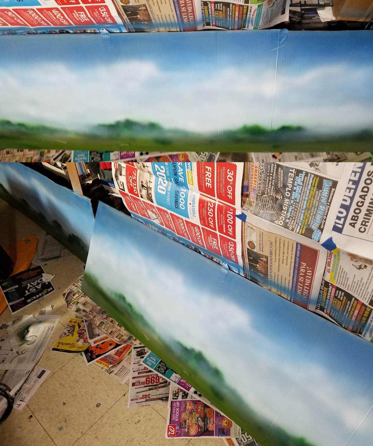
The second episode in the painted backdrop series begins with the second section, which was the "moveable" version, or the free standing piece that could work on either side.
I have published a few articles already on how to match your terrain to your mats. This mat by Table War has some very rich greens, particularly along the edges. This meant that I had to make some adjustments to my backdrops.
This was a happy accident, because I needed to go lighter and warmer anyway to make the "forward" edge of my backdrop come forward!
This is what 12 feet of painted backdrops looks like!
Again, using the Badger paints and primers was very useful, working with the Patriot 105. The misty nature of the scenes is necessary to make this flat upright board flow into the background instantly.
When I placed my new backdrops next to the mat (from Table War), I saw that I needed to make some adjustments. This was not a surprise, and you will see how those corrections were made later in the post.
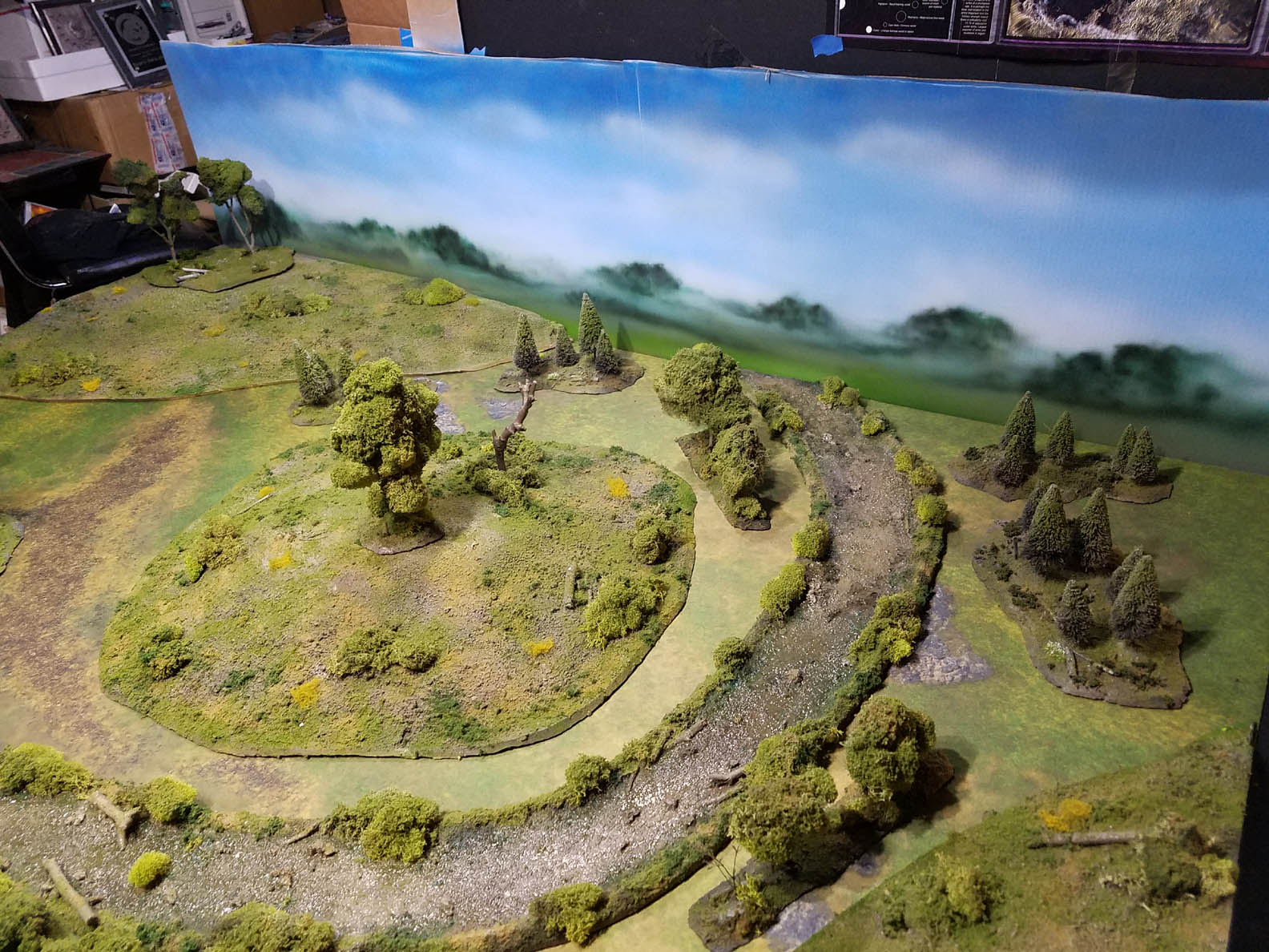
It was nice to get the first views of the backdrop behind all the terrain that I had worked so hard to create!
In this image, you can get a real sense of how I tried to mimic the appearance of the "real" terrain on the backdrops. Gently rolling hills and clumps of trees off in the distance would be an ideal image to have in the backdrops of all my battle report images.
I was very happy with the way the two sections blended together at the joint. Even at this '"open" end, it was blending in quite nicely.
The advantage of having those corner hills meant that I could hold the corners together very well, and hide a lot of the seam. The downside of that was that I had to make the horizon line a little higher to compensate... making it more difficult to get that far distance flattening of the landscape on those backdrops.
These ground level views are the entire reason why I wanted the backdrops. When I take the images of what is happening on these battlefields, this will be the primary 'cinematic' angle. Constant images from the bird's eye view get very boring in a hurry!
I still can't believe how it has affected the colors of my terrain and the mat. Before the backdrop, the colors seemed burned out in some places, or grayish. I really loved this surprise! I knew that I was using some nice rich greens and browns on my terrain, but it was not until now that I saw this.
Troops moving through these woods will have an extra level of realism to be sure!
This trail that was part of the battle mat was nearly invisible from this angle prior to the addition of the backdrops.
At this point, I did make some adjustments to my terrain pieces, just as I would do on the backdrops. I used the airbrush to add the same brighter greens to the edges of my hills and forest sections which would echo that on the battle mat.
I even sprayed some color on the tree foliage, which made a dramatic difference on some of the sections which did not get as much coverage of the flock on top of the original moss.
As I looked at how the various areas of the backdrop meshed with the terrain board, it was clear that the scatter terrain I mentioned would be necessary. I thought that I would experiment with a few items that I had available.
Some of this were pieces of grassy 'carpeting' which will be used for farm fields. It was easy to cut these leftover strips into irregular shapes to place at these seams. The clumping flock from Woodland Scenics could be piled on top of this to create some instant terrain.
Here are a few images of how this worked out. I will definitely make some more special corner sections of trees and bushes for these areas, which will be the next tutorial on this board.
Once again, if these articles are helpful, it would be great if any contribution could be made to the Patreon page:


Excellent!
ReplyDeleteThanks! It's hard to believe that I finally have my backdrops!! :-)
DeleteThanks! Can't wait to get some minis on here! :-)
ReplyDelete