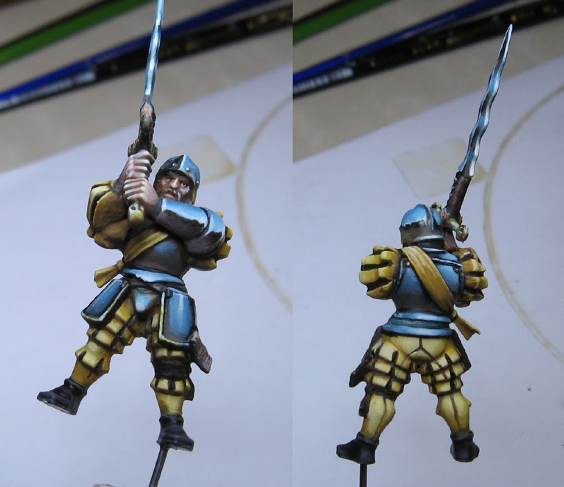
Hey folks... I just happened to have the camera nearby, so I snapped some images as I was painting another Greatsword. The LED lights really work much better for these kinds of things.
This mini is in that Shaded Basecoat stage that you hear me talk about so much. Notice the filbert brushes nearby!
Yes, that is a Cool Whip container lid. I have used far more bizarre things for a palette, I assure you!
As always, the idea behind the Shaded Basecoat is to start lighter in order to set up the subsequent glazes.
In these next few images, you will see some of that glazing and shading. Sometimes I use glaze colors such as the GW glazes or Secret Weapon washes. There are times I will just water down paint. Sometimes I will mix in glaze medium to thin down a color.
More dark glazing... but also tinting. I am trying to get a variety of warm and cool in the yellows, but also establish the darker blues on the armor. Later, I will do some 'light glazes' on that armor for both the sky and earth portions... but especially on the earth colors.
These crazy curvy blades are a nightmare, but an interesting challenge! The 'light glazes' can really help here, since they are basically semi-transparent lighter colors.
More lightening of the metals, but more warm earth tones continue to be added.
With many of the armor shades well on their way, I started working more on the yellow.
Can't forget the base! I tried to have some green here, so that the blueish colors would not be the only place on the entire mini where you would find cooler colors...
More definition on both the metal surfaces and the yellow. Sharper edges near blended edges help to create that hard/soft edge contrast that is vital to make metals.
Here is how it stands now. More work to be done. Also, the Army Painter brush on dullcoate will help to eliminate some of the shiny areas. Those are created by the various materials that I use and mix together.
Stay tuned for the big finish!


Outstanding, and I must say the way you take the time to build the contrast and how far you push the lights and darks; and the way you show this on your website, has really helped me with my painting over the last year as it's something i've struggled with in the past, often preferring to be more subtle and keep it a good read at the 2" i am working at, rather than being brave and achieving impact at the 3feet it will be seen at.
ReplyDeleteso thanks, and don;t stop :)
It is so good to hear that this sort of thing can be helpful! That makes it all worthwhile :-)
DeleteDefinitely like seeing stills of your WIPs.
ReplyDeleteThanks! They are really fun to see long after the project ends and look back at them!
DeleteAmazing NMM technique!
ReplyDeleteThanks for the kind words!
DeleteVery nice! Thanks for the picture-full tutorial.
ReplyDeleteThanks for checking it out, and I am glad it could be of use!
Delete