As I work out the fluff for the Dark Eldar, I realized that I also needed to do the same for their opponents, the Knights of the Broken Blade.
As you have probably seen in previous posts, the Dark Eldar are after a Hippodrome on this Imperial world, which is being defended by that particular chapter of marines. I had to figure out what it was that they were racing in that Hippodrome. When I saw the Raging Heroes cyberwolves, then I knew... dire wolves!
The locals gather by the hundreds of thousands to watch these spectacles. The marines take the largest and most powerful of these wolves and 'enhance' them with cybernetic parts.
The final battle takes place in the Hippodrome, similar to the battle for Manila during WWII... part of which took place in a baseball stadium.
So, to begin, I knew that I wanted the locals to have a more Romanesque feel, which meant one thing... mosaics!
I started the process by laying down some basic colors and patterns.
I didn't want to get too crazy with details at this stage, since the mosaic tile effect would not be very visible if there was a lot of blending.
I kept the basic colors as greyed down and neutral as possible, so that the final brighter colors would stand out more as individual tiles, without having to outline every single one!
I took some Reaper dark liner paints, and my liner brush, and set about making those tile patterns. They tend to be pretty straight, but they will also follow curves, a bit like directional brush strokes.
Cracks were also added at this point.
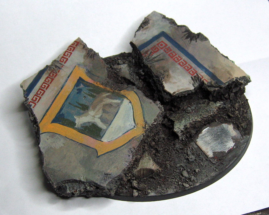
You can see that some lighter (and brighter) colors were added on the shield design and the surrounding part of the patterns. A few 'missing' tiles were designated by some very dark paint.
More of the interior design was brought to life by adding those brighter colors. You can see the increasing contrasts in the wolf and the two figures beneath it. I had looked for Roman Wolf Mosaics online, and had found an image that had an 'ancient' feel. This was to contrast with the sleeker more modern Dark Eldar freehand...
With a few more bright tiles added, you get the impression that some of the tiles are catching more light than others, or are at a slightly different angle, etc. It's a little like an impressionist painting, as you are working with dots of paint, for the most part!
I also added some clumps of grass and flock, for a bit of color and texture contrast.
Next up is the Hero on the Cyberwolf, kindly donated by Raging Heroes!
I am hoping to do another one of these designs on a Venom base, and a few more on the jetbike bases... stay tuned!!


Mind blowing good stuff! I find it frustrating that you can do these kind of things with ease. (So it seems)
ReplyDelete:-)
He he... what I didn't get a chance to photograph were the 4 times where I painted over stuff that wasn't working out! ;-)
DeleteOr the decades of practice, and art theory and technique. I can't wait until your videos are out. :)
DeleteThat's a scary prospect to think of how long I have been at this, and the 12-19 hours a day spent doing it :-) Or is it scarier that there is still so much that I want to learn ?
DeleteHere I am spending my Friday night thinking of way to give the new Tau minis bases some extra pop and BAM! You whip this out.
ReplyDeleteAbsolutely legendary!
Many thanks! I hope that this gives you some great ideas for those new Tau. I also hope that GW makes them worthy of all that work :-)
DeleteI need to make quit a large base and thanks to you I got bucketloads of inspiration. Thanks! :-)
ReplyDeleteGlad to be of use! I hope you have lots of fun making it! :-)
DeleteFabolous tutorial for a mosaic look !!
ReplyDeleteI will have to try this for my Witch Hunter warband !
I hop that it works out great!
Delete