So, when you are away from the studio for the whole day, but you need to make some kind of progress on an army display board for Armies on Parade, what do you do?
You break out the ole graph paper and start planning! :-)
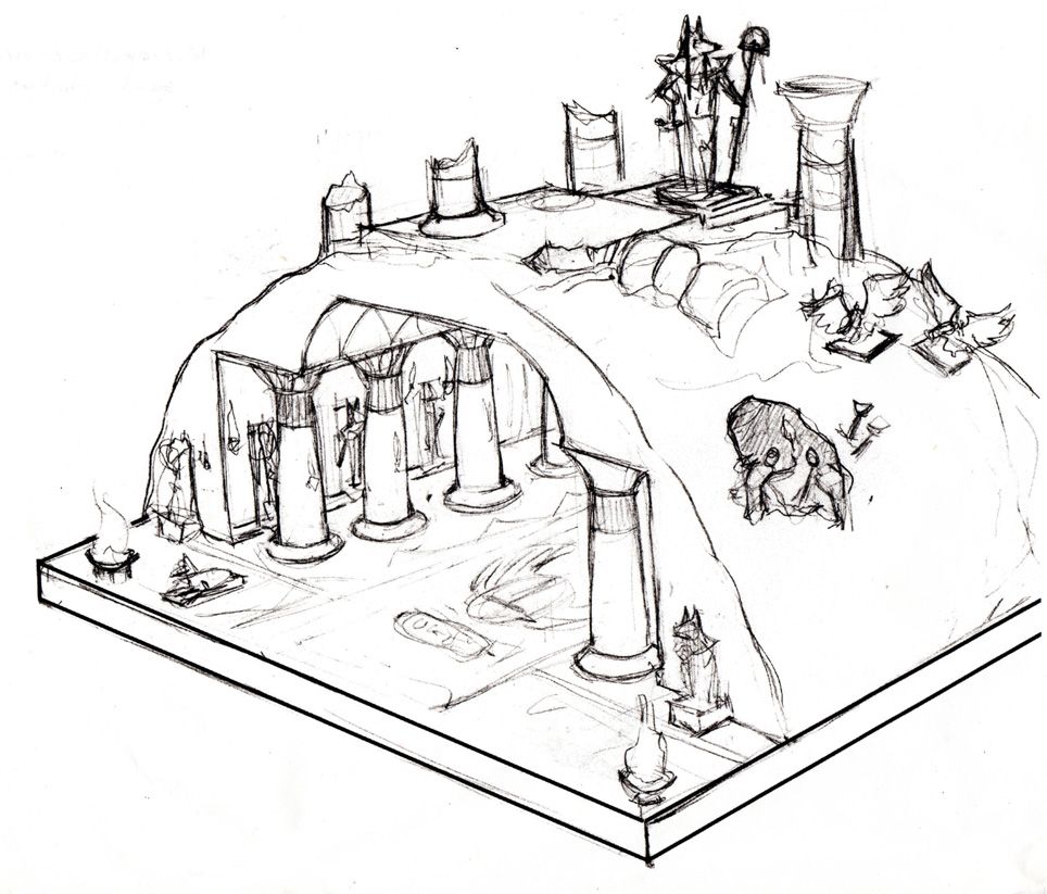
Most of you have probably seen the original concept sketch of the army board (included in this post as well if you haven't!). However, some changes had to be made so that it would fit in the display cases, and I needed to explain the story of the army in a more pictorial form. My first idea was to tell the story through heiroglyphs that the viewers could read and translate using a guide.
However, that proved to be impractical, in that the glyphs would be too small for people to see from the estimated distance, not to mention that they would not have the time to do all that translation!
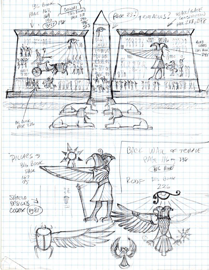
Since I knew I wanted to have more of a 'backdrop' on the army board, via a wall/gate, I thought I could use that space like a giant billboard, showing images of the God and his reluctant ally, and how that uneasy alliance came to be.
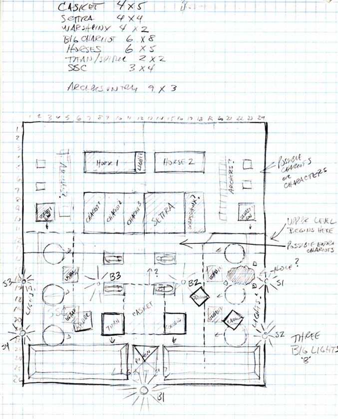
The first drawing is more of a floor plan. I needed to figure out just how much I could fit inside the temple, and if the movement trays would work in that confined space. As it turns out, I will have to abandon my movement trays in order to get everything to fit in there. You can see the measurements taken of the various units and their respective 'footprints'. It was clear right away that I would need to break them up into smaller more flexible bits!
The board is 24 x 26, and you can see that one square on the plan is equal to 1 inch. Man did space get used up fast! I had to leave room enough for the lights as well. I realize that is is a bit hard to translate all the information on the drawing, as it is mostly shorthand intended only for me. I just thought it would be fun to see that now, since the board itself will be made next week.
I had to deal with 2 levels worth of construction and units, hence the dashes, filed in areas, and other scribbles!

This set of drawings was done to get a feel for how I wanted to do the actual graphics, and find very specific reference images to work from. Most of these are for the exterior temple sections, but a few also cover the inner sanctum portion of the temple. I think that the totality of all these images and glyphs should get the point of the story across quickly. You can see that story in the previous threads about the army. The overall design of the back wall/gate could change dramatically depending on what happens when I build it! :-)
I also had to come up with an Egyptian looking rendering of the Lord of Change Tzeentch god. It proved to be far more difficult than I anticipated. The pylon might also change in design as well.

Here is the original concept art for the board:
